Photographers I Love: Lee Miller

Photographers I Love: Lee Miller

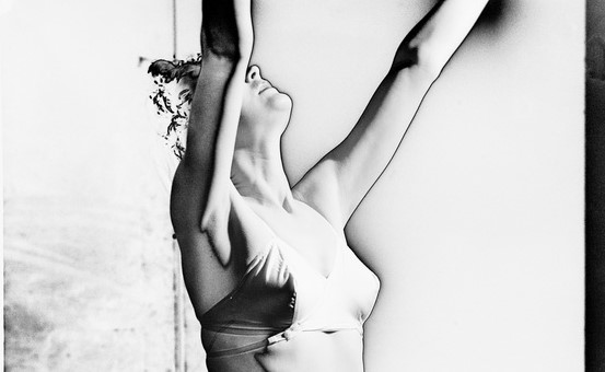
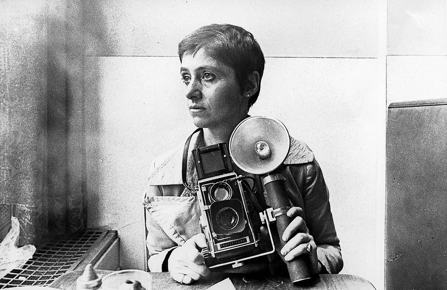
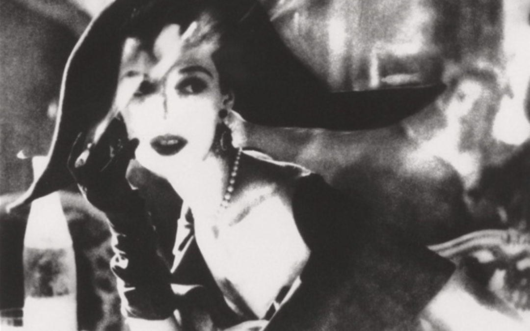
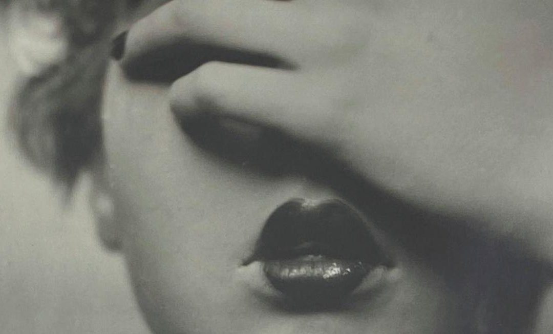
NOTE: The Lee Miller Archives graciously loaned me 2 images to illustrate this article. If you want to see more of her work, please go to www.leemiller.co.uk.

For too long, Lee Miller was known solely as a muse (and lover) to Man Ray, the beautiful face behind some of his most famous photographs. She seemed to have lived a charmed life – a model for US Vogue turned It Girl in Paris’ 1930s surrealist art scene. But thanks to her son, she has recently come to be seen as a full artist in her own right. Her extraordinary life even became the subject of a Hollywood biopic starring Kate Winslet.

EARLY YEARS

Born in 1907 in Poughkeepsie, New York, USA, Elizabeth “Lee” Miller learned about photography through her father, an amateur shutterbug who taught her the rudiments of the craft. Her seemingly happy and privileged childhood was shattered when a family relative raped her when she was only 7. The resilience and strength she displayed later in life are rooted in that trauma (but, too often, trauma makes you strong, until it destroys you).

Lee posed often for her father, sometimes nude, well into her teenage years. Many wonder what this early sexualization might have done to her psyche, adding to the trauma of being raped. Perhaps not surprisingly, Lee was restless and was expelled from numerous schools. She found catharsis in the arts, studying theater lighting and set design, life drawing and painting.


MODELING DAYS

At 19, according to legend (as told by Lee’s son, Antony Penrose), Lee nearly got run over in a busy Manhattan street. Condé Nast, the publishing magnate, came to her rescue; she fainted in his arms… and a few weeks later was on the cover of Vogue! [Although lovely, I somewhat doubt the veracity of this tale. I picture Lee more likely throwing herself into traffic to catch Nast’s attention than playing damsel in distress! But who knows? Life can be stranger than fiction.]

Lee was beautiful and became a sought-after model and It Girl, but the glamour faded quickly and left her wanting more. Unlike many of her contemporaries, modeling was a stepping stone, not the destination. The unfortunate (and unauthorized) use of her image in an ad for Kotex pads precipitated her decision: as fashion turned its back on her for this unsavory connection, she left fashion behind to return to her true love art.

"I'd rather take a photograph than be one." Lee Miller

BECOMING A SURREALIST

In 1929, aspiring to become an artist, Lee moved to Paris, then the center of the art world. She quickly met everyone who was anyone, from Picasso, Joan Miro, to Jean Cocteau (for whom she starred in Blood of a Poet, his 1932 film) and formed lifelong friendships with fellow artists.

When later interviewed about how she became a photographer, she explained, “I thought the best way was to start out studying with one of the great masters in the field, Man Ray.” Armed with a letter of recommendation from Edward Steichen for whom she had posed, she went to see the famous artist. Although Man Ray didn’t take students, he eventually relented when faced with her determination. They worked together and became lovers. She posed for him and assisted him.

Together they developed solarization, a technique that reverses the negative and positive parts of a photo, and created iconic images (although the credit went to Man Ray alone for a long time). Man Ray later credited Lee for his renewed inspiration at the time.

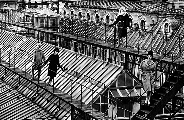
Tired of Man Ray’s jealousy, Lee went back to New York in 1932. She set up her studio with one of her brothers where she photographed celebrity and high society portraits, fashion series, and advertising images, often with a Surrealist edge. She became a sought-after photographer as everyone wanted to have their portrait taken by her. Critics and galleries took notice and her work was featured in a few shows.

True to form, she didn’t shy away from dark and unsettling subject matters – she once got ahold of a woman’s breast after surgery and photographed it on a plate, like a macabre couple of poached eggs!


WARTIME CORRESPONDENT

After only two years, Lee married Aizi Eloui Bey, an Egyptian businessman, and moved to Cairo with him. Her work there moved from portraits to landscape and street photography. Ever restless, she traveled to Europe where she reconnected with her artistic circle. She eventually met British Surrealist artist Roland Penrose, whom she became involved with. The beginning of World War II found her now divorced and living in London with Penrose. While other Americans were fleeing to safety back home, she decided to stay in her new adoptive country. She became a prolific contributor of articles and photography for British and US Vogue.

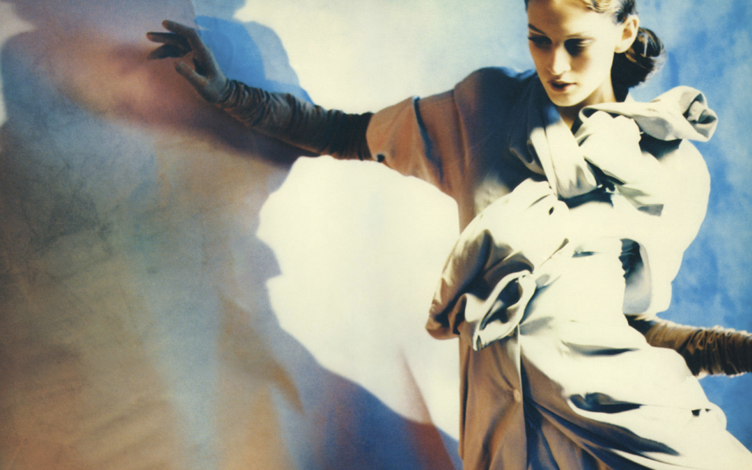
For them, she documented the Blitz and photographed fashion models among bombed-out buildings – a real-life Surrealist moment! The now commonplace images of models in high fashion posing against a backdrop of ruins and desolation owe a lot to Lee’s ground-breaking work. Her reporting transformed the luxury fashion magazines into serious news outlets. Her photographs helped American audiences connect with the horrors and terrors of the war.

Through the Conde Nast publication, Lee was able to get her accreditation as a photographer with the American Army in 1943. Partnering with David E. Scherman, Life Magazine war correspondent, she documented US troops’ victorious march through Europe. Armed with her camera and determination, she became one of the first female war correspondents, and the only one to see combat. In a time when women were often relegated to the sidelines, she stepped into the forefront, challenging gender norms in a male-dominated realm.

"I'd love to be a fashion photographer with a machine gun." Lee Miller

GRITTY REALITIES OF WAR

Her wartime photographs are not just snapshots; they are powerful narratives that force you to confront the stark realities of conflict. Surrealism helped her capture the human folly of war. As Roland Penrose observed, “Her eye for a surrealist mixture of humor and horror was wide open […] The only meaningful training for a war correspondent is to first be a Surrealist – then nothing is too unusual.”

Lee photographed battles, field hospitals and the liberation of concentration camps where she witnessed the horrors of the Holocaust. She traveled through Eastern Europe to photograph the devastating aftermath of the war. She never flinched and held her camera up to bear witness. When few people could or would believe the atrocities committed by the nazi regime, she implored Vogue to publish her images, with a simple message, “Believe it.”

Her most famous photograph is of her taking a bath in Hitler’s private bathroom in Munich right after Germany’s defeat. Taken by Scherman, the image is no mere documentation. Lee craftily set it up, purposefully dumping her dusty combat boots on a white bathmat and placing a small portrait of the defeated nazi leader on the edge of the tub in which she was now bathing. As Lee recalled years later, “I washed the dirt of Dachau off in his tub.” This portrait captures best what Surrealist painter Eileen Agar said of Lee, “a remarkable woman, completely unsentimental and sometimes ruthless.”


POST-WAR LIFE

Post-war, Lee lived with Penrose in the British countryside where she ventured further into Surrealism. Her photographs became portals to alternate realities, blurring the lines between dream and wakefulness. It’s not just about capturing an image; it’s about distorting reality and reshaping it into a narrative that demands attention. Her favorite subjects were fellow artists she had met and befriended over the years. Although she stopped working as a professional photographer in the 1950s, she continued photographing her friends, a veritable who’s who of modern art, including Picasso, Magritte, Joan Miro, Max Ernst, or Jean Dubuffet.

She eventually turned her creativity to food. She trained at the famed Cordon Bleu school in London and created surreal dishes, from cauliflower shaped into breasts (with cherry tomatoes for nipples!) to green chicken or blue pasta. Although there’s little documentation about domestic endeavors, there’s no doubt in my mind that they are still part of her Surrealist work. Food became a new venue for her to express herself and question normality.

"I believe in the imagination. What I cannot see is infinitely more important than what I can see." Lee Miller

PERSONAL STRUGGLES

The traumas of her life eventually caught up with her, and she entered a long battle with depression, PTSD, and alcoholism. Although people encouraged her to show her work, she refused and rarely if ever talked about her past. She hid away her photographs and negatives in the attic, as if trying to shut the door to the horror she had been through. Her legendary fearlessness turned into demons that tortured her for the rest of her life.

Her son talks frankly about growing up under the shadow of such an erratic mother. Many in his situation would have turned their back, but true to his mother’s own determination, he decided to try to understand her. After her death from cancer in 1977, the chance discovery of 60,000 old photographs, negatives and documents helped shed light on what his mother had experienced and lived through. He has since made it his life pursuit to share his mother’s legacy and dispel the myth she was just a pretty face.


LEGACY

Lee wasn’t just a witness to history; she was a participant, breaking free from the shackles of society’s expectations. While she was for a long time only seen as a source of inspiration for great male artists like Man Ray or Picasso, she was in fact their equal, using them for her own inspiration as much they did with her. She was no silent muse but very much part of the conversation.

In a way, her life followed the Surrealist view of the world. Like many in her circle, she had very little care for money, marriage and respectability. That freedom was easier for men than for women – yet Lee lived her life as freely as she could, defying society’s expectations and limitations. It’s ironic that her image as a fashion model or muse to 20th century great artists has overshadowed her own artistic achievements, a case of a tree hiding a forest.


© Lee Miller Archives, England 2024. All rights reserved. leemiller.co.uk

Disclaimer: Aurelie’s Gallery does not represent Lee Miller. My “Photographers I love” series is purely for inspiration and to encourage discussion.

Photographers I Love: Diane Arbus

Photographers I Love: Diane Arbus

Diane Arbus transformed photography by turning her lens toward the downtrodden and forgotten, favoring “freaks” over the polite society into which she was born. Hers is a tragic tale, one of an unwavering woman who pursued her art against all odds.


EARLY LIFE

Born Diane Nemerov on March 14, 1923, in New York City, USA, she grew up in an affluent family. Her father ran Russek, a successful department store, while her mother hailed from a wealthy and influential family. Their money insulated young Diane, even while the Great Depression destroyed countless lives around them. While many in her privileged circle clung together and showed little interest in the less fortunate, being cut off from the world had the opposite effect on Diane. She spent the rest of her life in search of the reality she was forbidden to see as a child. Diane Arbus later said about her privileged childhood, “It was like being a princess in some loathsome movie… and the kingdom was so humiliating.”

The Nemerov household offered both freedom and tradition. Her parents were not very involved in raising their children, as was often the case then in high society. Her father was busy with work, and her mother navigated between an active social life and bouts of depression. Diane was exposed to arts and culture, nurturing her curiosity and creativity. Her artistic gifts were apparent early on, and her father encouraged her to study painting and drawing. (Interestingly, she later befriended Richard Avedon, another photographer known for his portraits, who was also born into a family of luxury retailers.)

Lee Miller by Man Ray, photographer in 1929

PHOTOGRAPHY BEGINNINGS

Society’s expectations for a young lady of her class narrowed her freedom – a weight she rebelled against early on. Diane fell in love at 14 with one of her father’s employees, Allan Arbus, who worked in Russek’s art department. Her parents disapproved of this misalliance, but Diane continued dating Allan in secret. In 1941, at the age of 18, they married against her parents’ approval. How much was it for love? How much was it to flee her suffocating milieu? I’m not sure it matters – the courage and fortitude she showed then defined the rest of her life.

They had two daughters and from 1946 to 1956 ran “Diane & Allan Arbus,” a photography studio for fashion and advertising clients. Diane worked as a stylist and art director, while Allan had the more prestigious (and manly) role of photographer. Despite their success, they both came to loathe the commercialism of their work. Allan encouraged her to take her own pictures, and she later credited him as being “[her] first teacher.” But she ultimately found herself caught in yet another insulating environment. Her safe and predictable life was not what she had dreamed of when she fled her family.

Their respective discontent and Diane’s episodic depression put a strain on their marriage. They stopped working together in 1957 and separated two years later. When the norm was to be (and stay) married, Diane Arbus had the courage to find her path. Although they remained close and Allan supported her efforts, she found herself alone with two young children to care for. Everything piled up on her at once: she had to find her voice as an artist while rebuilding her life as a woman and mother.

FINDING HER PATH

Diane Arbus studied with documentary photographers Berenice Abbott and Lisette Model. She credited Model with making it clear to her that “the more specific you are, the more general it’ll be.” Model also helped her identify what she truly wanted to photograph. With her sheltered life squarely left behind, Diane Arbus began her search for truth and reality. Immersing herself in portraiture, she captured subjects often considered unconventional or outside of “normal” society. She photographed rich old ladies in the Upper East Side of Manhattan and drag queens performing in underground clubs. Her lens became a bridge between the ordinary and the extraordinary. Her images are at times disturbing and always unflinching. They explore how personal identity is a social construct. Her subjects vary but all wear some form of a mask, whether it be men wearing makeup, performers in their costumes, or baby-faced teenagers in grown-up clothes. Her portraits focus on what she called “the gap between intention and effect.” The distinction between what we try to communicate about ourselves and what is perceived by others is a recurring theme in her work.

In late 1959, Diane Arbus began a relationship with the art director and painter Marvin Israel that would last until her death. He became one of her most fervent champions, advising and encouraging her, and he introduced her to people who could help her. Around 1962, she left behind her 35mm Nikon camera and its grainy images and switched to a twin-lens Rolleiflex, which captured crisp square images. She explained this transition, saying, “In the beginning I used to make very grainy things… But [after a while], I began to get terribly hyped on clarity.”

Lee Miller taking a bath in Hitler's bathtub

DIANE ARBUS AND HER SUBJECTS

The square format of her prints became part of her signature. Their tight focus helped her emphasize humanity over trappings. The subject is front and center, nothing else really matters. Diane Arbus pioneered the use of flash in daylight, which, by separating the person from the background, adds a dose of surrealism to her images. “For me, the subject of the picture is always more important than the picture,” she said. “And more complicated.”

Her new medium-format camera was held at the waist. She would simply look down into the viewfinder, which allowed her to maintain eye contact with her subjects while shooting. Not having the photographer hold up a camera to their face must also have helped people relax and forget they were being photographed. The intimacy of this setup helped her establish a more direct connection with the people in front of her lens.

Diane Arbus is indeed famous for forming strong personal relationships with her subjects. She even rephotographed a few of them throughout the years. And supposedly slept with some of them [I don’t think the lurid allegations would elicit much response had she had been a man … but I digress]. She was alternately described as shy and sweet or as tough and cold. Her ability to relate to her subjects, along with her openness and vulnerability with them, set her apart. Her intense relationship with her subjects became central to her work. Although her images can seem merciless, her writing clearly shows how much she cared for the people she photographed.

CONTROVERSY AND CHALLENGES

Diane Arbus further engaged with life at the margins of 1960s America. She photographed circus performers, nudists, the elderly, and the mentally or physically handicapped… People who were often ignored by the art world then. The intimacy of her images confronted viewers with their biases. As her photographs gained recognition, they also sparked debates about boundaries and artists’ responsibility. While some attacked her for invading the privacy of her often-disadvantaged subjects, others lauded her for exposing uncomfortable truths. Her images were either seen as empathic or harsh and voyeuristic. But why can’t she be voyeuristic AND empathic? I’m not sure the two are so mutually exclusive. And aren’t we all a bit voyeur? She might have gone further than most, but the (uncomfortable) truth remains: we all like to watch.

In 1965, the Museum of Modern Art included three of her images in its “Recent Acquisitions” show. Diane Arbus was apprehensive and feared the public reaction. Her concerns were validated when she learned museum staff had to wipe visitors’ spit off her portrait of a drag queen in curlers. People felt threatened when looking at her images. She showed things most people were told to avoid. She found the attention hard to cope with and remained anxious for the rest of her life.

To support herself and her kids, Diane Arbus took assignments for magazines such as Esquire and The Sunday Times Magazine. She also taught photography at the Parsons School of Design in New York and RISD in Rhode Island. Constant money problems added pressure to her already complicated life. Juggling between editorial jobs, higher education establishments, and her art practice was a struggle. It was also rare at the time. It’s common today for artists to work in different fields but that was frowned upon in the 1960s when people tended to stay in their lane. She challenged the norm here again.

In 1967, MoMA included her in “New Documents,” a major show about documentary photography. Her work appeared alongside Garry Winograd and Lee Friedlander, two celebrated artists. The show was polarizing, and Diane Arbus was again accused of exploitation and voyeurism. Now labeled the “freak photographer,” she saw her editorial jobs dwindle as magazines became wary of the controversy surrounding her. The show that should have established her firmly in the art world unwittingly further marginalized her.

Despite the pressure, Diane Arbus remained steadfast. For her, photography was a powerful medium for exposing the truth, no matter how uncomfortable it may be. In an interview, she remarked, “I really believe there are things nobody would see if I didn’t photograph them.”

STRUGGLES AND RECOGNITION

Diane Arbus had the idea to create a limited edition of ten of her photographs, placed in a clear plastic box. She aimed to sell each set for $1,000, but there was no real market yet for fine art photography (especially when its subject matter was deemed “unsavory”). She managed to sell only four portfolios during her lifetime, but often had to sell individual prints for a mere $100. In 2023, one of these early sets sold for £1 million at Christie’s NY – a world record price for the photographer. More importantly, the work turned Artforum’s editor-in-chief into a convert. He had long been a photography skeptic and never agreed to show it in the famed art magazine. But after meeting Diane Arbus and seeing one of her boxes, he said, “One could no longer deny photography’s status as art. What changed everything was the portfolio itself.” In 1971, Diane Arbus went on to become the first photographer to be featured in Artforum.

But the recognition couldn’t erase the hardship. Diane Arbus suffered from depression and hepatitis, an illness that further weakened and depleted her. She also found herself in an untenable position, caught between her need for money and her fear of public attention. It all came to an end when she committed suicide on July 26, 1971; she was 48 years old. A year later, her work was included in the Venice Biennale, a seminal art event. Her photographs were described as “the overwhelming sensation of the American Pavilion.” She was the first photographer ever featured there.

DIANE ARBUS’ LEGACY

Although tragic, there’s a real risk that her death overshadows her work. To see her as a depressed figure who reveled in the abject denies her strength. To dismiss her work as morbid means we don’t see her for the humanistic photographer she was. She created a new form of documentary portraiture, one that is deeply personal and intimate. Her photographs show as much the vulnerability of her subject as her own frailty. Nan Goldin is her direct heir, exploring people in the margins of society and her relationships with them. The two artists share the same refusal to judge their subjects.

I love what Norman Mailer said about Diane Arbus, “Giving a camera to Diane Arbus is like putting a live grenade in the hands of a child.” What I love most is that, although he meant it in jest (he was supposedly displeased with the portrait she took of him), his dismissive quip betrays a truth. Diane Arbus was indeed a force to be reckoned with.

Painfully controversial in her lifetime, Diane Arbus was accepted only after her death. She is now considered one of the most influential artists of the 20th century. Her work continues to resonate with modern audiences. Her intimate portraits challenge preconceived notions of a photographer’s place and distance from their subjects. They question our voyeuristic nature and the predatory nature of photography (and of all art forms, really – if not of life itself!). Diane Arbus’ story is one of rebellion, resilience, and artistic brilliance. From her privileged upbringing to groundbreaking work defying societal norms, she remains an inspiration to many.


“My favorite thing is to go where I’ve never been.” Diane Arbus

PS: I recommend Fur: An Imaginary Portrait of Diane Arbus, a 2006 movie with Nicole Kidman. Though not a strict biography, fiction can reveal reality.

© The Estate of Diane Arbus. Disclaimer: Aurelie’s Gallery does not represent Diane Arbus. My “Photographers I love” series is purely for inspiration and to encourage discussion.

Photographers I Love: David LaChapelle

Photographers I Love: David LaChapelle

David LaChapelle’s over-the-top images blend art, fashion, pop culture and representation. At first glance, they may appear superficial (and even kitsch), but beneath the glitter is a throve of meaning – with a good dose of sex and humor thrown into it!


THE EARLY YEARS

LaChapelle was born in Connecticut, on March 11, 1963. If you’ve never been to Connecticut, think of the movie Pleasantville – all so white, all so straight. He would later recall being bullied and feeling the pressure to conform.

When his family moved to North Carolina, the bullying got worse, and David ran away to New York. The city promised freedom. It was a place of unbridled creativity, where self-expression was the essence of life. David worked briefly as a busboy at Studio 54, a high temple of celebrity and debauchery back then. His art would later blend fame and sex with the same abandon as the one he had witnessed at the infamous club.

David LaChapelle eventually went back home to attend high school at the North Carolina School of the Arts. There he studied painting but left the brushes behind to pick up a camera. High school over, he went straight back to New York and moved there in 1980 at age 17.

Art student by day, nightclub fixture by night – David LaChapelle delved deeper into the vibrant art world and the equally vibrant LGBTQ+ scene of the time. His frequent presence at drag balls at the Pyramid Club fueled his imagination and creativity. He sat at the epicenter where questions of self-expression and identity came into focus in the US. Long gone was the conformity of the 1950s and 1960s, when strict gender norms ruled, and anyone deemed different was ostracized. Reflecting on his early experiences, David LaChapelle remarked, “New York in the ’80s was a kaleidoscope of stories, each corner telling a tale, and every person a character in a grand narrative.”

An early gallery show landed him a job shooting for Interview, Andy Warhol’s magazine. His work was noticed, and other magazines and ad clients came soon knocking on his door.

“Photography is communication. It’s about saying something powerful with an image.” David LaChapelle

Lee Miller by Man Ray, photographer in 1929


SIGNATURE STYLE

David LaChapelle’s work is both surreal and hyper-realistic. It’s sexy and fun, provocative and thought-provoking. It reminds me of Guy Bourdin, but a Guy Bourdin on steroids (if you can imagine!). It mixes Catholic imagery and gay porn references. It’s profane and sacred. It verges on kitsch while referencing classical paintings… In short, it’s a magnificent chaos! Or, as an art critic called it, “kitsch pop surrealism.”

His sense of color is unique and arks back to when he used to hand paint his negatives before processing them. Imagine the skill such a task requires. How long it would take. How tedious it must have been!

David LaChapelle’s ability to create extraordinary narratives became his signature style. His mise en scene became more elaborate as years passed (and budgets grew). As a former producer for photo shoots, I also admire the work that goes into creating his fantasyland. He doesn’t construct his elaborate setups on a computer. He prefers shooting real locations and has his subjects interact with real props instead of standing in front of a green screen. Obviously, there is postproduction in his images – some elements are stitched together on a computer, and colors are now tweaked digitally. But Dave LaChapelle still captures as much as possible on camera. No CGI here even if the resulting images may look too unreal to be true.

“I’ve always tried to push the boundaries of what photography can be and do. It’s not just about documenting reality; it’s about creating it.” David LaChapelle

CULTURAL COMMENTARY THROUGH IMAGERY

Under all the glamour and fun, LaChapelle’s work explores themes of gender identity and advocates for acceptance. He brought LGBTQ+ aesthetics to the mainstream with his hyper-glamourous and sexed-up subjects. Tellingly Amanda Lepore has often appeared as his muse. Known for her exaggerated femininity and outrageous fashion style, the transgender icon embodies the intersection of beauty, gender, and artifice that characterizes much of LaChapelle’s work.

His images mix Surrealist, Catholic, erotic and gay references in a hedonistic frenzy. His mother hailed from Lithuania, a deeply catholic country; no doubt the images of a semi-naked Jesus on the cross he grew up with left an indelible mark on him. This is evident in “Jesus is My Homeboy,” which portrays Jesus in modern-day scenarios, interacting with everyday people. The images are a visually arresting commentary on modern life and religion.

David LaChapelle often faced controversy for his sacrilegious and pro-queer images. But he never wavered. In 1995 he photographed two sailors kissing for a Diesel perfume ad. It was the first time a gay kiss appeared on an ad. When you live in New York or other progressive places, you don’t think twice about two men kissing in the street. But that scene was revolutionary for many. The campaign launched during the debate over “Don’t ask, don’t tell,” a policy that prohibited people in the US armed forces from revealing their sexual orientation. The image was seen as a provocation and got LaChapelle a lot of hate. But it serves as a testament to his desire to normalize the LGBT+ community. No longer ostracized, derided or scorned, queer culture is now part of everyday life. Its mere visibility helps push forward acceptance and tolerance.

“I believe that art should liberate the soul, provoke the imagination, and encourage people to go further.” David LaChapelle

Lee Miller taking a bath in Hitler's bathtub

CELEBRITY COLLABORATIONS

His imaginative staged photographs continued gaining recognition. In 1991, The New York Times wrote, LaChapelle is certain to influence the work of a new generation…in the same way that Mr. Avedon pioneered so much of what is familiar today.

I’m not sure the prediction came through as LaChappelle remains unique in his vision and how far he will go to turn his mad ideas into reality. Nevertheless, he indeed changed the game with his powerful use of high and “low” cultural references.

His move to Los Angeles doesn’t surprise me. It is after all the heart of pop culture, the cauldron where fame, consumerism and sex merge. It’s also the perfect artificial paradise, a postcard of happy sunny people in a happy sunny place.

As his career ascended, David LaChapelle was able to collaborate with ever bigger celebrities. I marvel at how he’s able to get superstars (with superegos) to play along in his wild and elaborate setups. That takes gumption. I also admire him for keeping true to his vision. His photo shoots might be wild, with tons of extras, loads of props, and crazy narratives, but he stays the course.

“My portraits are more about me than they are about the people I photograph.” David LaChapelle

A RETURN TO HIS ROOTS

Despite his success and acclaim, David LaChapelle grew dissatisfied with his life and work. He saw himself as part of the consumeristic machine he had grown to despise and adding to the superficiality of the time. The frenetic pace of commercial assignments left no time and space for his personal work. He found himself disconnected from his art practice, drowning in a sea of bling and artifice.

In 2006, David LaChapelle traded Los Angeles for an off-grid organic farm in Hawaii. The move away from the pressure of commercial work reignited his creativity, as did his renewed connection to nature. His work shifted to explore complex themes with greater depth. Questions about redemption, consumerism, and the human condition are often framed within biblical and mythological narratives. The images have become more spiritual and introspective and often carry a critical view of humanity’s trajectory.

After years of wandering in the superficial worlds of fashion and celebrity, David LaChapelle is happy to be an artist again.

“In the end, we only regret the chances we didn’t take.” David LaChapelle


© David LaChapelle. Disclaimer: Aurelie’s Gallery does not represent David LaChapelle. My “Photographers I love” series is purely for inspiration and to encourage discussion.

Photographers I Love: Seydou Keita

Photographers I Love: Seydou Keita

I love how Seydou Keita’s images use the formality of 19th-century bourgeoisie portraiture in an unmistakably African setting.

Seydou Keita ran his studio in Mali’s capital, Bamako, from 1948 to 1962. He captured not only portraits but a changing society, as his country went from being a French colony to being independent. His black and white images endured the test of time and are now celebrated for their formal beauty and humanity.

Born in 1921 in Bamako, Seydou Keita came from a large family and first worked as a carpenter, following his father’s footsteps. After an uncle gifted him a camera, he learned the craft from friends and his own experimentations. What started as a hobby soon became his life and livelihood.

His studio quickly gained fame in Mali and neighboring countries in West Africa. His use of props and backdrops was unusual for the time and helped set him apart. A genius at marketing, Seydou Keita stamped his photographs “Photo Keita Seydou,” which helped spread his name far and wide. He also hired assistants to find clients all over Bamako, ensuring a steady stream of work.

You can chart Mali’s social evolution through his images as the country went through an extraordinary economic boom and modernization during Seydou Keita’s time. While his earlier photographs show men and women in traditional garbs, later work have them in suits and Westernized dresses. His subjects flash signs of their success, from purses or watches to a scooter or a car (even though some of these props were at times borrowed from the photographer!). Seydou Keita shows an idealized version of his subjects and the world around him.

Formal portrait of a younf Malian woman, sitting on a chair
Portrait of two young Malian women sitting on a scooter
Portrait of three young Malian men, standing tall, dressed in suits

As his access to professional gear was limited, Seydou Keita used mostly daylight. In his backyard turned studio, he hung fabric, echoing the rich velvet drapery found in classic paintings of noblemen. In Seydou Keita’s settings, velvet drapes are replaced by “wax”, a cotton cloth with batik-inspired printing and commonly found in West Africa, turning a European art tradition on its head.

Seydou Keita patiently directed his subject, showing them examples of past portraits and directing them toward the best pose and attitude. He often took only one frame as his clients could not afford more. (One frame! Think of this next time you fill your 5mg card shooting the same thing for 2 hours!)

Portrait of a Malian woman, with her traditional dress laid down around her, sitting down, with a patterned fabric in the background
Formal portrait of a Malian woman, dressed in traditionnal dress and headdress, sitting regaly in front of a richly patterned African fabric

In 1962, after Mali gained independence, Seydou Keita was offered a job as the official government photographer – an opportunity he couldn’t pass. He closed his studio a year later. His work stayed mostly untouched for 30 years before being “discovered” and exhibited in the West in the 1990s.

Seydou Keita is now regarded as the father of African photography. His images are iconic representations of West African life and culture in the second half of the 20th century. His legacy lives on as his work continues to inspire a new generation of photographers who aim to capture the diversity and richness of African life.

© Seydou Keita

Disclaimer: Aurelie’s Gallery does not represent Seydou Keita. My “Photographers I love” series is purely for inspiration and to encourage discussion.

Photographers I Love: Sebastião Salgado

Photographers I Love: Sebastião Salgado

Are Sebastião Salgado’s photographs too beautiful for their subject matter?

I asked myself this while watching “The Salt of the Earth,” a documentary, about Sebastião Salgado. It’s a beautiful film (no surprise there as Wim Wenders was at the helm), but it left me filled with questions and doubts.

Here was a man who took stunning photographs of some of the most horrible moments in recent history. From the famine in Ethiopia in the 1980s to the genocides in Serbia and Rwanda a decade later to burning oil fields at the end of the Kuwait-Irak war, his images are incredible. The black & white is rich and saturated; the skies are dramatic, and the people evoke biblical imagery of suffering and sacrifice. The images are heroic in scope, received numerous awards and praise, and found their way to art galleries and museums around the world.

Yet, the reality they show is one of despair and death.

While one can question the “beautification” of misery, we could argue that beauty makes people look at things they would usually avoid. As Sebastião Salgado said, “The beauty of the photographs lends dignity to the people in them.” He further explained, “I felt a compulsion to show that dignity is not an exclusive property of the rich countries of the north but exists all over the planet.”

Moreover, why should beauty and documentation be mutually exclusive? Beauty is a tool to reach people – look at the iconography of the crucifixion in Christianity: pain and death are sublimated to inspire piety. Beauty does not negate the problems. Sebastião Salgado uses it to show us the harsh reality too many people face in this world… Ultimately, as all artists, he does what he does and wouldn’t know (or want) to do it any other way!

“When you take a portrait, the shot is not yours alone — the person offers it to you.” Sebastião Salgado

African mother holding her baby against a chest in a refugee camp
A lone worker walks among burning oil fields in the Kuwaiti desert

Sebastião Salgado was born in 1944 in Brazil and grew up on his family’s cattle ranch. He left his remote childhood home to study macroeconomics in ever-expanding São Paulo. Embroiled in the fight against the military dictatorship, he and his wife, Lélia, fled the country and settled in a life of exile in Paris, France. Sebastião Salgado started working as an economist for the International Coffee Organization. It was during his trips to document coffee farmers in Africa that he took some of his first photographs (using his wife’s camera that he had borrowed for the occasion!). What started as a simple tool to help in his work soon took over his life. In 1973, he left a promising career as an economist and began working as a freelance photojournalist and documentarian.

Sebastião Salgado mostly worked on long-term self-assigned projects, often documenting the aftermath of war, or focusing his lens on globalization and its consequences (migration, urbanization, working conditions…). He worked for news organizations and NGOs alike, always championing social justice. His training as an economist helped him frame his work in a larger narrative, taking into account the politics and sociology of the situation. But he chafes at the limitations being called a “social photographer” or even a “photojournalist” brings. For Sebastião Salgado, photography is “[his] language, [his] life and [his] way of going about and doing things.”

“You photograph with all your ideology.” Sebastião Salgado

For his series “Gold,” he spent time in an open air-gold mine in Brazil where thousands of men toiled in horrendous conditions. His photographs bear witness to the folly of gold: people left everything and ended up working in dangerous conditions in the hope of striking it rich with a crack of their pickaxes. The images of mud-covered men toiling on the flank of a mountain look almost biblical. You might as well be looking at ancient Egyptians building the pyramids.

Sebastião Salgado’s choice to shoot in black and white comes from his early photos taken in Africa as an economist. They were in color, but he felt color was distracting from the core information he had tried to capture. I can see that – B&W eliminates superfluous details and helps us focus on what truly matter: someone’s look, an object, the scope of a landscape… Black and white is also timeless, which makes sense for Salgado’s work as it is often linked to a larger, longer story. His series on migrants talks about modern-day workers but evokes the 19th-century industrial revolution, which marks the beginning of today’s reality.

An African family walking in the desert in search of food and help

After years of documenting man’s cruelty, Sebastião Salgado eventually burned out, depleted after witnessing so much misery. He changed course and left wars and conflicts behind to document earth’s beauty and diversity, going back to nature to cleanse himself of man’s sins. For “Genesis,” he traveled to 32 countries over 8 years, from the Artic Circle to New Guinea and the Amazonian jungle. His focus is nature and man’s resilience against all odds. Images of pristine lands and people who live in accordance with their surroundings offer us inspiration and hope.

While always deeply concerned with people’s fate, his work on “Genesis” broadened his preoccupation. “Today I think of the other species too – they are as important as my own. The behavior of our species, what we do to nature, to other species, to each other, is awful, so I have the same skepticism about us that I always had.”

The Brazilian military regime having made way to democracy, Sebastião Salgado returned to his home country. There, he decided to take care of his family farm which had been mismanaged for decades. The lush vegetation of his youth was now an empty wasteland. He and his wife set out to rebuild the original ecosystem, planting thousands of trees and encouraging animals and birds to come back. They turned their 17,000 acres into a nature preserve and created the Instituto Terra, a nonprofit organization dedicated to reforestation, conservation and environmental education.

Today, his environmental local work goes hand in hand with his photography work. There’s something admirable about the arc of his life. He credits growing up in nature for his appreciation for light and attention to detail. After years of documenting the world in all its folly and chaos, he’s again on his family land, bringing it (and himself) back to life. Man and nature, life and death, hope and despair… they are all part of him.   

Amazonian indigenous woman with a traditional headdress

© Sebastião Salgado

Disclaimer: Aurelie’s Gallery does not represent Sebastião Salgado. My “Photographers I love” series is purely for inspiration and to encourage discussion.

Photographers I Love: Nick Knight

Photographers I Love: Nick Knight

Nick Knight may well be the most creative fashion image-maker there is. There’s something very British about his work – it mixes both punk and old-world elegance. He’s the Alexander McQueen of photography (or maybe Alexander McQueen was the Nick Knight of fashion?).

His style and mediums vary through the years, but his creativity remains constant. He keeps on reinventing himself and his work. I’m really in awe of his boundless imagination and his technical mastery.

Nick Knight was born in 1958 in London (UK). He studied photography in college and published his first book, “Skinhead,” when he was still a student. It got him noticed by none other than i-D, the famed British magazine, which hired him to shoot portraits. His i-D images really put him on the map and he was soon shooting for major fashion companies.

Besides working for Yohji Yamamoto, John Galliano or Alexander McQueen, Nick Knight also directed music videos for Bjork, Massive Attack, Lady Gaga or Kanye West. In 201, he was even commissioned to shoot Queen Elizabeth and Prince Charles’ official portraits for the Queen’s 90th birthday. Quite a long way from the skinheads and punks of his youth!

His endless creativity and curiosity make him a ground-breaking force. His images are striking and arresting, no matter the subject, from supermodels to flowers. His work is rooted in classical arts while being resolutely avant-garde. Nick Knight knows his classics, and he’s not afraid to reinvent them.

He’s also not afraid of exploring controversial subjects like ageism, fatism or body mutilations-slash-enhancements. His work challenges conventional ideals of beauty and shows us the endless ways one can choose to be. He pushes the envelope of what we expect from a fashion image, filling them with hybrid creatures, half-cyborg half-human. For Nick Knight, the future is already here.

This is especially true in his recent NFT series, “Ikon-1,” with gender-bending model Jazelle Zanaughtti. Nick Knight found her on Instagram through her performance art and endless self-reinvention. They worked together during covid to create images where Jazzelle appears in surreal digital fashion designs and bespoke IRL hairstyles and nail designs. The different elements were either scanned or created in CGI, and then superimposed onto Jazzelle’s avatar.

A model wearing a CGI-created outlandish fashion
Woman cloaked in a large black coat and hood, smelling a flower and wearing mysterious embellished graphics on her face
Model Shalom Harlow walking, wearing a light dress

Nick Knight’s embrace of AI and new technology is no surprise as he has always been at the forefront of what comes next. He was an early adopter of 3-D scanning, live-streaming and AR (augmented reality), using these new tools when no one else did. He recently recalled, “When I first started 3-D scanning in 1998, it launched a whole new vision of what image-making was about.” The same is true for today’s AI and metaverse.

In 2000, Nick Knight launched SHOWStudio, a film studio and creative lab. The company pioneered online fashion films and created unforgettable AR videos and live-streamed fashion shows. The studio is a well of new ideas and new talents, always pushing boundaries and continually reinventing what a fashion image can be.

Model Shalom Harlow walking, wearing a light dress
Model wearing a futuristic outfit surrounded by lights movements

In 2010, for his services to the arts, he received an OBE (Officer of the Most Excellent Order of the British Empire), one of Britain’s highest recognitions. His work is in museums, including Tate Modern, Victoria & Albert Museum, and MoMA, while major art galleries represent him. In 2016, his photograph for the fashion designer Jill Sander broke all records at auction at Philips Hong Kong, selling for HKD 2,360,000 (US$ 301,665 in today’s exchange rate).

With all these developments, can we even talk about Nik Knight as a photographer? He certainly doesn’t see himself that way, recently saying, “For the last 20 years, I’ve been saying I’m not a photographer. What I do now isn’t really photography anymore, because it’s just way outside of that.” To drive the point further he added sculptures to his creative repertoire, using alabaster, titanium, wax or even ice cream.

His interest in fashion stemmed from his interest in self-expression. The new technologies and mediums are only bringing us new ways to exist. While some fear this brave new world, Nick Knight is forging his own unique way ahead.

Deserted research facility building, half fallen in ruins

© Nick Knight

Disclaimer: Aurelie’s Gallery does not represent Nick Knight. My “Photographers I love” series is purely for inspiration and to encourage discussion.

Photographers I Love: Nadav Kander

Photographers I Love: Nadav Kander

Working with Nadav Kander has long been a dream of mine as a producer. And although it will remain just that, a dream, I’m OK with it because I still get to enjoy his images!

I remember vividly when I first saw Nadav Kander’s work: I was a fresh-of-the-boat art buyer intern at BBDO New York and Bill Stockland, his agent in the US, came to show us books. Bill was a great agent – I’m sure he could have sold snow to Eskimos – but Kander’s photographs didn’t need any selling.

I love their stillness and intimacy. His soft color palette lures you into the images. I read that he reworks them in post-production to achieve the desired color effect. For Nadav Kander, an image is not finished until he gave it a treatment. Post-production is an integral part of his creative process, not just an addition.

His work is infused with melancholy, loneliness and isolation. Besides his muted color palette and love for dark and moody atmospheres, he often photographs lone figures, lost in vast landscapes. Ruins are also a recurring theme in his work – from Roman artifacts to a deserted Chernobyl, Kander explores what is left after time and death. One of is series is in fact titled, “Signs We Exist,” which shows what people leave behind: nail holes in walls where posters were; cigarettes butts buried in the sand on a beach; marks left by long-gone chairs on a floor; peeling wallpaper in abandoned flats…

Nadav Kander’s portraits share the same melancholy and depth. They at times feel like a psychological exploration of his sitter. Through reflections, dark backgrounds, or simple props, Kander offers us a glimpse into his model’s inner life. The images are unmistakably his.

At a certain level, I don’t see separation in my work: a landscape showing the palm print of humanity upon the natural world, the way we exist within our environment, is as much a portrait of a human being as a close-up photograph of a person.” Nadav Kander

Actor Stanley Tucci sitting on a chair in a dark room, holding a glass panel in front of him
A man, standing alone under a large bridge

Israeli-born, London-based photographer Nadav Kander (b. 1961) grew up in South Africa during apartheid, an experience that marked him. As he later recalled, “I grew up with injustice all around me; apartheid was in everyone’s bones.”

Nadav Kander learned about photography and its endless creative possibilities thanks to his father who used to photograph their vacations. His dad’s slideshows remain a vivid memory to this day. He started taking pictures at 13 and was interested in the early masters, like Strand, Stieglitz, Weston and Atget. Studying their work, Kander saw you could explore a range of subjects as long as you remain true to your sensibility and experience. While the subject matter changes and you need to adapt to it technically, your creative intent should remain constant. That freedom stayed with Nadav Kander, who is equally celebrated for his landscapes as he is for his portraits.

During his mandatory military service in South Africa, he managed to be drafted into the Air force and then into a darkroom where he printed aerial pictures for two years. That experience only reinforces his determination to become a photographer. He left for England soon after where his career truly began.

There are poetry and quietness in his world (and, at times, unease). Nadav Kander’s photographs act as a small meditation; looking at them brings in an immediate sense of stillness. I feel better already, don’t you?

Deserted research facility building, half fallen in ruins
Lone person, seen from the back, sitting at a picnic table in a park at night
Lone man on a small boat in a river, under a gigantic overpass

© Nadav Kander

Disclaimer: Aurelie’s Gallery does not represent Nadav Kander. My “Photographers I love” series is purely for inspiration and to encourage discussion.

What I learned during Aurélie’s Gallery’s first year

What I learned during Aurélie’s Gallery’s first year

November 9, 2022

Today marks our first year anniversary! I launched Aurélie’s Gallery with just 3 photographers – 3 amazing people who trusted me with their work and decided to support me in this new adventure.

The road had been bumpy with a lot of false starts, delayed launch dates and website bugs. I was banging my head against the wall and thought the day would never come… and then, our website designer sent me a message saying the site was up and running!

I remember the moment clearly: I was out treat-or-tricking with friends’ kids up in Harlem in New York. Not the best moment to deal with work but there you have it – the life of a small business entrepreneur!

After years in advertising and fashion, organizing photo shoots, searching and hiring photographers for ad campaigns, curating photography portfolios and working on a photography magazine I had launched with a friend, I had met many talented photographers. I was looking for something new to do, a new challenge, a new project, a new way to work in photography, and the idea of having a gallery came naturally.

I thought at first of having a physical space, and although having a spot to call my own and model the way I saw fit was enticing, I also knew I would quickly hate having to go to a white cube, waiting for someone to walk in. Besides, the cost of renting a space was prohibitive for the self-funded start-up I was. The next best thing was to go online. (The covid pandemic only reinforced the need to have a virtual gallery, accessible anywhere at any time, free from time and space restrictions.)

Early on a friend of mine told me my job would be both art, commerce AND technology – truer words were never spoken! I learned so much these last 2 years! From SEO to social media, from e-commerce platforms to newsletters, from print on demand to shipping and sale tax… the learning curve before and during this first year has been steep at times and some topics remain quite obtuse despite my best efforts (I’m looking at you, SEO).  Technology constantly changes and evolves so there’s always something new to learn and try, which I enjoy. Work is never boring when you keep on learning new things!

It’s now time to pause and reflect on this first year.

There are plenty of things I would do differently if I did them today. Insight is 20/20 and all that jazz… But I do believe I did the best throughout the process with the information I had at the time. Regrets are a waste of time: learning and moving on is a much better use of my time!

What did I learn during this first year? Here are the Cliff Notes:

  • When starting a business geared toward the general public, don’t underestimate how long it will take said public to notice you. Be ready for the long haul, and don’t get discouraged when you hear only crickets. Keep at it – time takes time.
  • Write a business plan (or better yet, work with a business consultant on one). Putting your ideas on paper will help you clarify your vision. It also makes your business idea feel more concrete and real.
  • Financial projections are important but be prepared for slow growth (or little growth, or even no growth!). Overnight successes don’t happen that often (and organic reach on social media doesn’t happen at all anymore – stop dreaming!). You need to invest in your company for it to exist. Put money aside for it, have a part-time job somewhere else… do what’s needed to give time for your company to find its footing while still paying your bills.
  • Before launching, spend time creating a proper workflow and structuring your company. It’s not when you’re in the thick of it that you have time to work on the legalese of your contracts or figure out how to schedule your social media posts. Set things up before you put your baby out into the world.
Portrait of Aurélie
  • Create as much content in advance as possible: blog posts, newsletters (even if you only have 5 people to send them to), social media posts, website pages, product descriptions, … Have as much of them ready early on so you have a leg up and can schedule ahead of time.
  • Contact everyone you know and invite them to follow you on social, sign up for your newsletter, spread the word, etc… Let’s be real here: your first few sales will come from friends and family, and that’s OK (big shout out to my friends and family!).
Aurélie and photographer Andre Baranowski
Aurélie and photographer Jimmy Katz
Aurélie and photographer Jazzmine Beaulieu
Aurélie and photographer Edwin Jimenez

From the initial 3 photographers we started with, we grew to now 10 online exhibits! Our artists span genres and styles, from landscapes to portraits, from Black and White to color photography. I knew some of the photographers from my previous career, working with them on ad campaigns or on my magazine; others approached me to work together, while some were recommended by friends.

The artists we feature come from different horizons and have very different styles. Yet, one thing remains, I love their work. There’s not one image here I don’t care about.

Stay tuned for more!

If you missed it, read Part 1, Part 2 and Part 3 of how the gallery came to be.

Follow the blog for more of my adventures in entrepreneurship land!

Jazz Photographer Jimmy Katz & Giant Step Arts

Jazz Photographer Jimmy Katz & Giant Step Arts

I started Aurelie’s Gallery to champion and support photographers I love.

Case in point, Jimmy Katz and its foundation, Giant Step Arts.

Jimmy has been photographing the who’s who of the jazz world for the last 30 years. As NPR said, “How you know you’ve made it in jazz: you get your photo taken by Jimmy Katz!”

To further support a music genre he loves, he became a sound engineer and producer and started to record live albums. In 2018 he founded Giant Steps Arts, a non-profit organization focused on innovative music, free of commercial constraints. Donations help finance live performances and to give exposure to talented artists.

During the Covid lockdown, Giant Step Arts organized a series of jazz concerts in Central Park, NY. As clubs were closed, the outdoor performances were a much-welcome outlet for both musicians and their audience.

Trumpeter Jason Palmer in Central Park

Titled “Walk with the Wind” and honoring John Lewis (the pioneer congressman and civil rights activist), the performances took place in Seneca Village on the west side of the park.

The location was chosen not only for its acoustic quality but also for its history, which is steeped in the Black experience, much like jazz itself. Founded in 1825, Seneca was a refuge for freed Blacks and newly arrived Irish and German immigrants, far from the racism and xenophobia they encountered elsewhere.

Saxophonist Abraham Burton and drummer Eric McPherson in Central Park

The Giant Step Arts concerts were such a hit Jimmy Katz decided to record them whenever possible.

The live recordings feature trumpeter Jason Palmer with saxophonist Mark Turner, bassist Edward Perez and drummer Johnathan Blake. Saxophonist Abraham Burton and drummer Eric McPherson co-lead another performance, featuring bassist Dezron Douglas. True to Giant Step Arts’ artists-centric mission, the musicians keep the right to the music and sell it directly through their own channels and websites.

In a time of uncertainty and forced isolation, Jimmy Katz was able to create a bubble of conviviality and creativity through his foundation, Giant Step Arts. The world needs more bubbles like this, don’t you think?

Donate to Giant Step Arts here.

See Jimmy Katz’s jazz portraits here.

Entrepreneur’s life: Aurélie’s Gallery is 6 month-old!

Entrepreneur’s life: Aurélie’s Gallery is 6 month-old!

May 9, 2022 Today is more or less our sixth-month anniversary. I say “more or less” because we had so many false starts when it came to launching the website, so many delays, bugs and revised timelines, we ended up with the softest of soft launches. When people ask what the best and worst things about launching my online photo gallery are, it’s easy to know the worst part: creating the website has been the most challenging part of the process. I am not a coder, nor particularly fluent in geek-speak, so I’ve felt very lost. Finding myself so dependent on technology (and one I have very little understanding of) has been a huge adjustment. As a friend of mine told me early on, “Your business rests on both art and technology.” I didn’t fully hear her then, but I sure do now!

And now for the fun part of having this gallery: I love being able to share my love of photography! It’s as simple as that.

I’ve always loved photography (maybe because my childhood bedroom was covered in Sarah Moon’s images?). I love its immediacy and intimacy. It’s the most ubiquitous art form, one that speaks to most people. I feel photography has become a “lingua franca,” a universal language by which we all communicate.

I am also happy and honored to champion photographers whose work I love.

Coming from the advertising and fashion photo industry, I don’t recognize the usual barriers the art world sets up. There if you don’t have the right pedigree (read: education and/or connections), your work is devalued (or, at least, not as valued).

For me, what matters is my response to the images. The curation is personal – I love every image I am showing; it is not calculated according to the art world’s rules and expectations.

Lastly, I love the freedom I enjoy. It’s a huge privilege. Freedom to feature who I want, to work from anywhere in the world, to create this new business from scratch – making lots of mistakes along the way, for sure, but loving every second of it.

So, here’s to our first 6 months! I can’t wait to continue to grow and develop Aurélie’s Gallery. See you around!


If you missed it, read Part 1, Part 2 and Part 3 of how the gallery came to be.

Follow the blog for more of my adventures in entrepreneurship land!

Aurélie at work
Meet Photographer Kourosh Sotoodeh

Meet Photographer Kourosh Sotoodeh

Kourosh Sotoodeh had to leave his home country to pursue his photography passion. The road has not always been easy but the journey took him far and is still ongoing!

Originally from Iran, Kourosh Sotoodeh studied Industrial Design and Cinema before focusing on photography. He fell in love with the medium while photographing his friends and family. From there he started experimenting and building his portfolio, although his work was limited by the fundamentalist laws ruling over Iranians’ lives.

Koourosh eventually left his home country when it became clear he would never be able to work as a photographer and express himself as an artist in the Islamic Republic. Although there might not have been laws forbidding fashion photography per se, taking photographs of people (and of people of the opposite sex) falls in a grey area and is left to subjective interpretations.

There have been crackdowns on the Iranian creative class over the years. What is permitted one day is not the next day, the rules are unspoken and ever-changing – an impossible situation for any artist to live and function in!

Female model standing against a wall

Since then Kourosh Sotoodeh has made a name for himself in New York and Los Angeles, where he works on both editorial & commercial assignments for fashion and cosmetic clients.

Being a foreigner in the US myself (I’m originally from Paris), I know firsthand how difficult emigrating can be. You are confronted with a new language, culture, and social code. You’re the new kid on the block, with no support or friends. Everything needs to be built from scratch – it’s no easy feat.

Succeeding then is a testament to your talent and hard work (and just enough luck to make it all work!).

Woman dressed in Indigenous dress, standing on a rock in a desert
Female model wearing a bright red sweater and a bright Dior beret

The images presented here span genres and styles – from hyper-glamourous beauty shots to views of a starry sky. They come from both editorial shoots and personal work. I like the mix it creates.

I’ve always been a firm believer that it’s important for photographers to work on personal projects throughout their careers. If you’re only shooting for jobs (even editorial ones), you’re never free – there are always expectations and requests you need to worry about.

Personal projects allow you to truly express yourself. Which can be daunting for some. It’s equivalent to the fear of the white page for a writer!

I titled Kourosh Sotoodeh’s exhibit “Moments” as the images presented are a mix of past and present works, editorial images and personal projects. Aren’t all photographs moments after all?

Naked female back and buttocks
Portrait of a woman, topless, with wild hair, looking straight in the camera

How Aurélie’s Gallery came to be: The launch

How Aurélie’s Gallery came to be: The launch

October 21, 2021

We’ve been busy rebuilding the website before the launch. As painful as it is and as frustrating the delay is, at least I’m getting to know WordPress quite well!

I have to say that, one of the things I enjoyed the most about putting this business together has been learning new things. I’ve never been a techie but I am starting to understand how it works and to be able to figure things on my own, and that’s immensely rewarding!

November 1, 2021

We’re live!! Woowoo… although, to be honest, the launch is pretty subdued.

Between the website’s unpredictable hiccups and having to still contend with Covid, I didn’t feel like organizing an event. It’s not the launch I had envisioned, but at least we’re on!

We will have a party later, but now everything feels too tentative and complicated. Once things are more settled (and the health crisis is under control), I want to have a series of pop-up events, setting up a few days in NY, LA, Paris, etc… Wherever I can find a cheap space and I know people!

I already have a million ideas on how to run the events – fingers crossed I’ll be able to start them in the next few months.

Portrait of Aurélie Jezequel

December 1, 2021

After the launch, the first results are in: we got a lot of positive feedback (and some orders!). I am very happy with the 3 exhibits we started with. I think it’s a great mix.

Lori Adamski-Peek’s images of horses are stunning and different from what you usually see in “animal portraiture” (is there such a thing? I’m sure there is!). Andre Baranowski’s nature photography couldn’t be lovelier – just looking at it you can feel the touch of the sun on the flowers and the breeze in the leaves. And Martin Adolfsson’s minimalist images of suburban development around the world are intriguing. His work raises many interesting questions about globalization and uniformity.

I’m forever grateful to them for trusting me with their images and believing in my project.

January 2, 2022

It will be interesting to see how things develop. The launch was delayed so we were not really able to benefit from a full holiday shopping season. Fine-art prints take time to make so we cut it close for people to get theirs on time. Even the home & work accessories in the Gift Shop are made on-demand, which means it takes a couple of weeks to get them… Not ideal when you’re competing with businesses that promise next-day delivery!

We also can’t compete with cheap companies. I don’t have $50 prints – that’s not what we do. We will diversify in the coming months to offer a wider price range, but I know I’ll never be able nor want to compete with the “cheap & fast” companies.

I believe there’s a place for the gallery and what we offer. There’s a place for quality and uniqueness. We just need to find not only our audience but also our customers. They’re out there, I know it. After all, I’m out there! 😉


If you missed it, read Part 1 and Part 2.

Follow the blog for more of my aventures in entrepreneurshipland!

Portrait of Aurélie in front of a wall of photographs

Meet the Artists Kiritin Beyer and Parris Jaru

Meet the Artists Kiritin Beyer and Parris Jaru

“Reappropriation” is an apt title for this series. Abandoned spaces are reappropriated and turned into private playgrounds, while ancient customs are reinvented.

The photographs are a collaborative effort between Kiritin Beyer, a French & Danish photographer, and Parris Jaru, a Jamaica-born painter.

I met Kiritin a long time ago. When you both work in photography in New York AND are both French, you’re bound to cross paths! We moved in similar circles and worked a few times together. She has a very calm energy about her and you can feel some of it in her work. Her images are powerful but not “loud.”

I particularly love this series. Kiritin Beyer had shot an earlier series in an abandoned penal colony in French Guinea (West Africa). The place might have been empty, but she could feel the ghosts of its past.

A mysterious figure in a traditional African costume and mask dancing in a forest

This led her to the idea of “summoning” a character to stand guard in other deserted locations. Working with Parris Jaru and drawing on African, Indigenous and Caribbean rituals, Kiritin Beyer created costumes and searched for masks. They studied traditional dances and looked for forgotten places.

The resulting images are striking and filled with unanswered questions. A mysterious character inhabits a no man’s land of empty buildings that have been reclaimed by nature. He changes appearances and his face is always hidden by a mask.

We know nothing of him or where he is; he simply stands before us, caught in the middle of rituals and dances he alone knows the meaning of.

I love art that makes you wonder and takes you on a journey.

A mysterious figure in an African costume and mask lies down on the floor of an abandoned building

Photographers I Love: Javier Vallhonrat

Photographers I Love: Javier Vallhonrat

I’m not sure how well know Vallhonrat is in the US, but his work was famous in France back in the 1980s and 90s, and he’s this week’s “Photographer I Love”!

His work is moody and mysterious. Nothing is clearly shown, a lot is left to the imagination. The images invite us in and let us wander. They’re not didactic or straightforward; they evoke more a feeling than tell a story or show us something clear and precise.

Born in 1953 in Spain, Javier Vallhonrat got interested in photography early on as his father was a passionate amateur photographer. At 18, while studying Fine Arts, Vallhonrat started assisting a fashion photographer.

Fashion would become his focus. After making a name for himself in Spain, he broadened his reach and became a successful and sought-after photographer for magazines and advertisers alike.

I especially love Javier Vallhonrat’s approach to color and lighting. The way he uses them creates a sort of photographic painting (or painterly photograph!).

Javier Vallhonrat’s experimentations result in striking images. They remind me of Impressionism. And to think it is all done on film, not digital! That’s magic!


© Javier Vallhonrat

Disclaimer: Aurelie’s Gallery does not represent Javier Vallhonrat. My “Photographers I love” series is purely for inspiration and to encourage discussion.

Portrait of a woman
A female model sitting on the floor in a photo studio
Fashion model throwing a scarf up in the air

Aurélie’s Gallery video presentation

Aurélie’s Gallery video presentation

A funny thing happened when I decided to launch the gallery. I got super-crazy camera shy! Kind of a problem when you’re supposed to be the face of your company, isn’t it?

Here’s a little video presentation I shot early on that I am finally releasing. Be kind – don’t forget, being in front of a camera petrifies me! 

Let’s not forget the wonderful artists who believe in me and the gallery.

I (obviously) couldn’t do this without them! 

Close up of a black horse against a black background
White fireplace against a wall in construction
A shaded and flowery spot in a park
Japanese temple reflected on a lake
A woman dancing in a wheat field on a sunny summer day
Perspective on two different skyscrapers, each with a different architectural style and feel
Female model standing against a wall
Profile of a young woman, with her hair floating in the wind, and with superimposed tactile effects on the print
Aerial view of a surreal industrial landscape
Portrait of Ornette Coleman

Meet Jazz Photographer Jimmy Katz

Meet Jazz Photographer Jimmy Katz

Jimmy Katz is the most prolific and celebrated jazz photographer of the last 30 years.

As NPR stated, “How you know you’ve made it in jazz: you get your photo taken by Jimmy Katz!”

I am incredibly proud to show his work and grateful for his trust and support. We met through Tim, my husband, who worked with Jimmy and his wife Dena on a few of their shoots.

They opened their world to us and invited us to intimate jazz performances. Thanks to them, we got the chance to see some incredible talent and witness jazz’s creativity and mastery.

Jimmy Katz’s love for the music can be felt through his photographs. Since that fateful evening when, as a teen, he went to see Thelonious Monk and Art Blakey at Carnegie Hall, he has loved and breathed jazz. He now has more than 4,000 records and an encyclopedic knowledge of the music and its history.

One of his most cherished memories is when the great Andrew Hill invited him to sit practically under his piano during his last recording session. Hill was dying of cancer but enjoyed the creative energy of the moment. Art is an act of creation and so, by extension, it is life — never was this truer than on that day.

Over the last 30 years, Jimmy Katz has photographed the who’s who of jazz. He added audio recording and engineering to his arsenal to further his work and connections to the musicians.

Jimmy and Dena Katz have done over 200 magazine covers for Downbeat and Jazz Times alone and have worked on over 580 recording projects for a variety of labels. They have witnessed and captured creative collaborations few others ever get to see or hear.

Arthur Taylor playing on his drums
Portrait of Ray Charles
Greg Osby playing the saxophone on stage

Giant Steps Arts, the non-profit Jimmy Katz founded in 2018, is his way to give back to the community. Thanks to donations, he’s able to help musicians create personal projects free of artistic compromise or commercial constraint. Unlike with a traditional recording company, the musicians keep ownership of the master tape and are then able to sell their music freely.

The fact that Jimmy Katz knows his subjects so well gives an extra depth to his portraits. They are not just people in front of his camera for him – many are friends and people he has worked with over the years as a music recorder and engineer. He sits next to them while they play and works alongside them to capture improvised moments of musical brilliance.

Jimmy Katz approaches photography like a jazz musician approaches music. There’s a plan, yes, but there’s always room for last-minute changes and for that elusive magic all artists chase after. He brings all his gear to the set and chooses on the spot the ones that work the best for that moment. Like in jazz, things are calculated AND free – a perilous exercise many fail, but one Jimmy Katz excels in.

Portrait of Ornette Coleman

Photographers I Love: Nan Goldin

Photographers I Love: Nan Goldin

Nan Goldin’s photographs are not always easy to face. They show hardship, violence and pain. But they also, and more importantly, show life – the good, the bad, and the ugly of it.

Nan Goldin grew up near Boston in the 1950s. The Norman Rockwell image of suburban middle-class life imploded when her older sister committed suicide when Goldin was 11. Her sister wanted to live freely, but the loosening of social mores and the sexual revolution the pill introduced in the 60s hadn’t happened yet. Nan Goldin is a product of the liberation her sister never saw.

She started documenting her friends as a teenager, capturing unfiltered moments of intimacy and vulnerability. She befriended people in the LGBTQ+ community and ended up, a few years later, documenting the desolation the AIDS crisis brought to her friends.

Most recently, while documenting the opioid crisis that has been ravaging the US, Nan Golding became a vocal opponent to the Sackler family and their company, Purdue, which produced and pushed Oxycontin.

She targeted museums and universities that accepted their money and shed light on the ugly side of philanthropy. Nan Goldin’s activism bore fruit: in December 2021, the Met Museum in New York removed the Sackler name from its exhibition halls.

Glass table in a living room, covered with drug paraphernalia
A man dragging on a cigarette while his girlfriend watches him

Her interest in people on the fringe stemmed from her teenage rebellion and the cultural environment of the time. She saw junkies as romantic figures but eventually cut through the haze and saw them for what they were – tragic figures, people lost to forces stronger and darker than themselves.

Nan Goldin often explained that her photographs are like her own private diary, just one made public. They are her way to celebrate and remember her friends when so many of them have passed away or were never recognized by society. Her work is about memory, first and foremost.

Nan Goldin doesn’t shy away from the pain that sometimes comes with being alive. I remember her show at MoMA and seeing her (in)famous self-portrait where you see her with a black eye after an argument with her boyfriend. I find the image difficult to look at – the idea of getting punched in the face by the person I love is pretty terrifying for me – but there she stood, upright and strong, flaunting expectations of decorum or victimhood.

Her photographs are very intimate and raise at time question about voyeurism. I don’t think anyone can accuse Nan Goldin of being a voyeur – these are her people, her friends, her tribe. She shares these moments with them, lives their pain and joy.

But what about the people looking at these private moments? What about us, looking at these photographs hanging on a wall of a gallery or museum? Aren’t we voyeurs?

© Nan Goldin

Disclaimer: Aurelie’s Gallery does not represent Nan Goldin. My “Photographers I love” series is purely for inspiration and to encourage discussion.

Young man sitting by a pool
A young man laying on the trunck of a convertible car watching a movie at a drive-in, while his friends sit in the car
Photographers I Love: Jeanloup Sieff

Photographers I Love: Jeanloup Sieff

I had the incredible opportunity to pose for Jeanloup Sieff… but then never followed up to ask him for a print! I could kick myself!

I was working at BBDO, an ad agency in Paris, as an assistant art buyer (as we were called then) when his agent came to show us some books.

She thought I looked great, took a quick polaroid of me, and next thing I knew, I was meeting the great man himself!

Jeanloup Sieff was looking for nude models for a new book. I was then beyond shy and so ill at ease in my own skin that the idea freaked me out to no end.

But I did it, mostly to prove to myself that I could do it, and also because it was Jeanloup Sieff — the man was a legend in France! How could I say no?

He was nice and attentive, professional and patient. The shoot took place in his loft. I remember it was during summer and Paris was quiet.

A few weeks later, Jeanloup Sieff invited me back to see the contact sheet and choose an image for a print, but we kept on missing each other. I got busy getting ready to move to New York; I got scared and shy again… and I never went and never got my print!

When he passed away, that door closed forever… I don’t have a lot of regrets in my life but that’s definitely one of them!

Fashion designer Yves Saint Laurent, naked, sitting on leather pouches on the floor
Torso of a woman wearing a tight corset
Woman wearing high heels laying down on a bed

Born in 1933 in Paris, Jeanloup Sieff first dreamed of cinema before switching to photography. He started his career as a photo-reporter working for Elle and Magnum. Although his reportages got his recognition, he eventually moved to fashion and portrait work.

While living in New York in the early 1960s, Sieff shot for Look, Glamour and Esquire, among others. When he came back to Paris, his dramatic and sensuous black-and-white style was fully defined, and he went on to create striking images of the who’s who of that time.

Jeanloup Sieff’s use of dramatic lighting and darkroom printing techniques, like dodging, make his photographs immediately recognizable. From portraits to nudes to landscapes, all his images share the same strong compositional sense and tactile quality.

I could kick myself for not following up and missing the opportunity to have a print of his!

Nade woman laying on a couch

© Jeanloup Sieff

Disclaimer: Aurelie’s Gallery does not represent Jeanloup Sieff. My “Photographers I love” series is purely for inspiration and to encourage discussion.

Photographers I Love: Tyler Mitchell

Photographers I Love: Tyler Mitchell

Tyler Mitchell became the first African American to shoot the cover of Vogue US in 2018. He was also the youngest photographer to ever do so (he was 23 at the time!). The attention is deserved as he possesses both talent and vision.


Tyler Mitchell cites Larry Clark as an early influence, and I can see the connection. His subjects are the descendants of the 1990s cool kids Clark documented, just with a more elaborate fashion sense and more diverse backgrounds!

Growing up in Georgia, Mitchell purchased a Canon camera as a teen to shoot skateboarding videos of his friends. Inspired by Spike Jonze, he learned video editing on his own, through YouTube tutorials.

His subjects, be they models or everyday people, are effortlessly cool, like only cool 19-year-olds know how to be. They play with gender roles at times (a guy wearing a metal chain bra, a girl posing tough..), but there’s no activism beyond the images.

The freedom of being whoever they want to be is a fait accompli — that itself is activism! That lack of care of how people judge them shows their utter freedom from society’s expectations.

This freedom goes beyond gender roles; Tyler Mitchell brings the same casualness to his portrayal of Black America. His models are unrestricted by racial stereotypes. They are who they are, free of compromises and fear. Tyler Mitchell shows us images we rarely see, moments when being young and alive is all that matters.

2 androgynous black youth

Before attending Tisch Art School in New York, Tyler Mitchell self-published a book of his photographs of skaters and youth culture in Havana, Cuba. He graduated in 2017; after shooting a few series and portraits for Vogue Teen, he was picked in 2018 to photograph Beyonce for Vogue US’ prestigious September cover.

The fact that it took 128 years for the magazine to hire a Black photographer for its cover is both heartbreaking and infuriating. The Smithsonian National Portrait Gallery later acquired a portrait from this series – an acknowledgment of its historical significance.

Tyler Mitchell was later the center of a controversy about Kamala Harris’ Vogue cover in 2021. Many people judged it too casual, if not downright disrespectful toward the Vice-President. I have no interest in what I felt was a gratuitous controversy (my two cents: people who only knew Vogue took offense, people who knew Mitchell’s work did not) — what interests me is how free Tyler Mitchell’s images are.

I love how he captures the youth of today and celebrates the Black experience. I cannot wait to see what he does next!

“I aim to visualize what a Black utopia looks like or could look like. People say utopia is never achievable, but I love the possibility that photography brings. It allows me to dream and make that dream become very real.” Tyler Mitchell

© Tyler Mitchell

Disclaimer: Aurelie’s Gallery does not represent Tyler Mitchell. My “Photographers I love” series is purely for inspiration and to encourage discussion.

A young Black man standing in a flowery garden
Beyonce sitting against a sheet in the middle of a lush green garden
Photographers I Love: Gordon Parks

Photographers I Love: Gordon Parks

Gordon Parks is part legend, part man… and 100% trailblazer! Photographer, filmmaker, writer, musician… he was a true Renaissance man and led an extraordinary life.

Tim, my husband, is a huge fan and introduced me to Gordon Parks’ work. I was immediately hooked: Parks is amazing — there’s no art form he didn’t (successfully) play with and his life reads like an adventure book.

He was also a Black man in mid-century America. While many were crushed, his talent helped him forge a trailblazing path of his own.

Born in Kansas in 1912 under Jim Crow laws, Gordon Parks and his family faced discrimination and violence. He left at 14 after his mother’s death, and led an adventurous life, going from one odd job to another, one of them as a piano player in a brothel.

Completely self-taught, Parks landed a job photographing migrant workers for the Farm Security Administration.

In 1949, the documentary-based project led him to Life Magazine, a bastion of white establishment at the time. He was hired and became their first Black staff photographer. Gordon Parks later recalled he didn’t think twice about submitting his portfolio to the prestigious magazine – only when he was hired, did he realize he had succeeded in breaking a color barrier.

Life sent him to Paris in the 1950s. Paris was a very tolerant place compared to the States, and a lot of African American artists enjoyed there a freedom they didn’t have back home. The same was true for Parks.

A Black woman with her child standing on a sidewalk near a "Colored Entrance" neon sign

In a departure from his documentary work on poverty, crime and discrimination, he started photographing fashion for Vogue and Ebony, covering Paris’ haute couture collections. Gordon Parks brought to his assignments a dose of reality. Eschewing elaborate sets and poses, he favored movements and immediacy.

Life later asked him to document the Nation of Islam; Parks befriended Malcom X who gave him unprecedented access to the organization.

It is a testament to Gordon Parks’ versatility, insatiable curiosity, and empathy that he was able to feel equally at ease in so many different worlds! As he explained in “Half Past Autumn,” a documentary about his life, “I lived in many different skins.”

Protesters against police state

In 1969, Gordon Parks added another “first” to his career when he became the first African American to direct a major Hollywood film, The Learning Tree, a coming-of-age story based in part on his childhood. Never one to rest on his laurels (or do the same thing twice), his next movie, Shaft, was a classic of blaxploitation!

Throughout his life and career, Gordon Parks held an unflinching mirror to America and fought for civil rights and social justice. His work lives on and bears witness to where the country comes from and where it still needs to go.

I suffered evils, but without allowing them to rob me of the freedom to expand.” Gordon Parks

PS: “Half Past Autumn” is available for free on Vimeo – I highly recommend it!

© Gordon Parks

Disclaimer: Aurelie’s Gallery does not represent Gordon Parks. My “Photographers I love” series is purely for inspiration and to encourage discussion.

Meet Fashion Photographer Helena Palazzi

Meet Fashion Photographer Helena Palazzi

Helena Palazzi’s women are self-confident and in full power of their seduction. Her images celebrate femininity and sophistication and perfectly reflect her own dual nature.


Helena Palazzi grew up in Sweden, where equality between men and women is valued. I imagine this helped shape her image of women as strong and independent beings [which we are!].

Her early exposure to movies and fashion magazines fueled her with powerful iconography. It was the 80s, a time of big hair and even bigger shoulder pads, when larger-than-life supermodels reigned supreme.

Helena Palazzi’s interest in art brought her to photography. With a second-hand film camera and a darkroom set up in her family’s garage, she started to experiment, looking to capture fragile moments of beauty.

In her early 20s she moved to Italy, her father’s country. There her Scandinavian roots mixed with the Latin world and she embraced Italy’s sophistication and elegance.

You can see Helena Palazzi’s dual cultures in her work: her women are both strong and seductive, mixing the coolness of the North with the South’s vibrancy.

I love that mix and how beautiful and timeless her images are. The clothes might be right off the runway or from 10 years ago, it doesn’t matter: they are not the focus – the woman is.

Maybe because I also grew up in the supermodels’ area, but Helena’s depiction of women speaks to me. I feel the fashion world (and world at large) can always use more empowering images of women, don’t you?

A woman in fancy lingerie bathing in a milky bath

Helena Palazzi is also the nicest person I ever met in the fashion world! We worked a few times together, most notably for Resource Magazine, a photography magazine I had created with a friend.

For one series, we shot in Prospect Park in Brooklyn. We had a model, a small crew, some basic equipment, and LOTS of fake snow!

Things were hectic leading up to the shoot and I hadn’t had time to ask for a permit (!!). We just went and did our thing, all the while praying no one would catch us – thankfully, no one did and the resulting series was a big hit for the magazine!

PS: While the memory makes me smile, I don’t recommend winging it nowadays. Park officials have gotten a lot more diligent and are quick to shut you down if you don’t have the proper authorization and paperwork! Beware!

Woman in a wheat field

Photographers I Love: Tim Walker

Photographers I Love: Tim Walker

Tim Walker’s images are magical. I feel like Alice in Wonderland when looking at them!

His boundless imagination, his wit and sense of magic set him aside. You immediately know you’re looking at a Walker’s image when you see it. I find his work also eminently British, referencing old-world grandeur and fairytales. I think the world can use more of those, don’t you?

His images tell a story, and I happen to love stories. They are imaginative and witty, steeped in fairytales and childish wonder.

The models look like porcelain dolls or princesses, the world around them is both precious and fun, with unexpected details here and there (I give props to his prop stylists!). 

Tim Walker also experiments with distortion and weird perspectives. These images make me feel like I’m on an acid trip, hanging out with Tilda Swinton, a frequent muse of his (which, come to think of it, seems like a really fun way to spend the time).

Born in England in 1970, Tim Walker studied photography and worked for a while on Cecil Beaton’s archives, another great British photographer.

He moved to New York in 1994 (same year as me!) to become Richard Avedon’s assistant (not like me – I went less famously to work in an ad agency).

Woman in a spiralling staircase wearing an evening dress with a long train
Supermodel Karen Elson in a beautiful living room, playing the piano with a lion sitting next to her

He later confided working for Avedon was like going into the army for fashion photography: “There was a hierarchical, old-fashioned way of working, and I learned a lot.”

While Richard Avedon thrived on tension (and cultivated it), Walker keeps his sets light and fun. I feel you can sense that when looking at his work. I doubt he would get the same magic if his crew and talent were tense and freaked out (but then again, some people love drama!).

Tim Walker is old school and aims to capture as much as possible his vision on camera. He wants his models to truly interact and live in the fantasy he creates – even if for only a few minutes and only from a specific angle. There’s no CGI in his images, just old-fashioned pins, gaffer’s tape, set building and papier maché!

Although Walker shoots for commercial clients, he candidly admits not enjoying the process as, when working for someone else, you always have to compromise and too often end up giving in to the people who brought the check.

His heart is clearly in editorial where he doesn’t have to water down (too much) his vision. Walker often shoots for UK and Italian Vogue, which give him the freedom to turn his fantasies into reality. As he explained, “If you don’t compromise it will make a better picture.” Truer words were never spoken… Too bad most clients don’t / can’t / won’t hear them!

“Fashion is the only photography that allows fantasy, and I’m a fantasist.Tim Walker

Supermodel Stella Tenant in a long ballgown and large hat against a dark backdrop and surrounded by flowers
Woman sitting on the floor dressed in a white ballgown, next to a white peacock


© Tim Walker

Disclaimer: Aurelie’s Gallery does not represent Tim Walker. My “Photographers I love” series is purely for inspiration and to encourage discussion.

Photographers I Love: Ruth Bernhard

Photographers I Love: Ruth Bernhard

Ruth Bernhard’s images are both sensual and graphic in their simplicity. Her lighting and compositions elevate everyday objects and bodies to minimalist abstractions. 

Ruth Bernhard had quite a life. Born in 1905 in Berlin, in what was then the Prussian Empire, she went through the horror of World War I as a child. Her parents divorced when she was two and she hardly saw her mother afterward.

Her father was Lucian Bernhard, a famous graphic designer and artist, who became her champion and encouraged her to find her own voice.

She came of age in the Weimar Republic, that cauldron of arts and ideas, where Bauhaus aesthetics and ideals reigned supreme.

I wonder if her unconventional upbringing didn’t help her in a way as she was unburdened with society’s expectations of women. Ruth Bernhard was left free to become who she wanted to be and create the images she wanted to see — a rare thing for women at that time.

Ruth Bernhard moved to New York in 1927 and soon after started her photography career. She frequented other artists and became a fixture in the lesbian world, moving back and forth between the East Coast and California, before settling for good in San Francisco where she died in 2007 at 101 (!!).

Her female nudes are her more well-known works – and rightly so as they are stunning. But I’ll admit a fondness for her still-life photographs. They are very graphic and, at times, abstract. Look at the image she created using simple straws! Or the one with the Lifesavers candies! Her approach transcends her subjects and turns them into otherworldly aliens.

Ruth Bernhard might not be the biggest name in photography history (and not everything she did stood the test of time), but she deserves a second look.

After all, Ansel Adams, who knew a thing or two about photography, hailed her as “the greatest photographer of the nude” (high praise indeed!).

“If you are not willing to see more than is visible, you won’t see anything.” Ruth Bernhard

Rows of Lifesavers hard candies, neatly arranged to create an abstract visual

© Ruth Bernhard

Disclaimer: Aurelie’s Gallery does not represent Ruth Bernhard. My “Photographers I love” series is purely for inspiration and to encourage discussion.

Photographers I Love: Sally Mann

Photographers I Love: Sally Mann

Sally Mann photographs childhood like no other.

I am not a mother so I don’t have firsthand experience with kids. I only have a vague idea of what it means to have this viscerally physical connection with another being. Art gave me a glimpse into that reality.


Once was in Terrence Malick’s movie The Tree of Life, when you see a character lying down on the grass with her newborn baby – you could feel their closeness. The other time was looking at Sally Mann’s photographs of her children.

Sally Mann started documenting her family in the 1980s. They lived on an old farm in Virginia filled with history and surrounded by lush vegetation.

She decided to use an old 8×10 camera, which gives her images their timelessness, but also means these are the opposite of quick snapshots.

There’s nothing casual when working with a 100-year-old clunky large format film camera! Sally Mann’s images are carefully constructed, and she later spends hours in her darkroom to achieve the desired effect.

The resulting images are beautiful and poetic. They also raise at times uncomfortable questions. Your reaction to them will depend in part on your degree of comfort with the uncomfortable.

“Immediate Family,” her 1992 gallery show, became a lightning rod and deeply divided the public.

Some felt she was exploiting her kids; others argued her work was nothing more than an artsy take on child pornography, while her admirers praised her for capturing childhood and its complexity in such an honest way.

Portrait of a child fiercely looking at us while an adult off camera holds her
A young child's naked chest covered with flowers

Her images can be read on a multitude of levels, which creates ambiguity and, in turn, unease. Without context, without knowledge of her and her family life, you can see the worst in her world.

For example, in the portrait Damaged Child, her eldest daughter is shown with a swollen eye and looking angry. You would be forgiven to think she might a victim of child abuse. The truth is much simpler though: she was upset because she had been bitten by a gnat!

Another image shows a young girl holding what looks like a cigarette. Many people thought she was smoking when in fact it was a candy cigarette. Still not a good idea [full disclosure, we had them too in France when I was a kid], not obviously not as serious as a problem as kids actually smoking!

A young girl holding a candy cigarette as if she's smoking

I’ll be honest: some images do make me pause, if not make me uneasy. At the same time, I learned to lean into this discomfort and question it (and myself).

Great art is meant to raise questions so we learn more about ourselves and the world. It’s not always about bringing us answers – some questions have no answers – but about making us think.

I love Sally Mann’s work not only for its beauty but also because it challenges me.


© Sally Mann

Disclaimer: Aurelie’s Gallery does not represent Sally Mann. My “Photographers I love” series is purely for inspiration and to encourage discussion.

12-year-old girl sitting across a chair in a garden
How Aurélie’s Gallery came to be: The Struggle

How Aurélie’s Gallery came to be: The Struggle

February 1, 2021

After all these months of struggle and turmoil, I announced today on social media the upcoming launch of the gallery!

The response was wonderful – so many people congratulated me and made the jump to follow the gallery’s page. I am truly humbled by the outpouring of support.

I am also freaked out! I started to worry people were going to be disappointed and that I was not going to live up to their expectations. And putting out into the world made it all too real; I can’t just take my sweet time anymore – I said the gallery will launch in the spring so it needs to be! The ongoing struggle to get their business to life just went up in intensity!

I spent the last few months working on this, learning a ton about marketing, social media, entrepreneurship, sales tax and all that fun stuff. Except for my close friends, no one knew was I was doing, I was flying under the radar in my little bubble. That time is over: people now know, and I’d better deliver!

Although I had a freakout moment after making the announcement, I know I needed to take that step. I had to dive in, otherwise, I would have spent the next 6 months researching and tweaking things ad nauseam. At some point, you need to go into the world!

February 8, 2021

As soon as I made my big splashy announcement, I learned the website would take a lot more time than anticipated! We went from launching in the spring to launching whenever the site will be ready. The struggle continues.

Pushing the launch creates a whole set of problems: from having to revise the exhibits calendar to cutting our yearly revenue (but not our expenses!), from having to sustain people’s interest during that extended gestation period to reassuring the photographers who already signed up…

The setback really crushed me. It felt like the rug got pulled from underneath me. I was so looking forward to launching, to making this dream a reality, and it was exciting to feel I was getting closer…

[2022 Insight: I now realize my expectations were completely unrealistic. I had no sense of how long building a custom site takes and didn’t do due diligence to really understand what I was getting into. Lesson #1: when venturing to new territories, like coding and websites are for me, ask questions. And then ask some more questions, and some more, until you feel you have a bit of a grasp of what’s happening.]

Laptop on a desk

February 19, 2021

The struggle is still here, but I’m focusing on going onward and (hopefully) upward. I’m busy working on the non-fun part of the business – the business plan, financial planning and other fine print stuff.

[2022 Insight: although I found financial projections utterly pointless since there’s no way to know or even guess how much sales you will do, listing all the expenses your new business will face is incredibly helpful. Sobering, but helpful.]

I looked for new online groups to join. As a producer, I was part of a few amazing groups that would freely share their knowledge and resources, no strings attached. So imagine my disappointment when the female entrepreneurs’ groups I joined turned to anything but.

First, it felt like 99% of the people there were business/ marketing/ social media consultants. How many consultants does the world need? (no offense to consultants, some are incredibly helpful and insightful, particularly the one we worked with putting this business together, Stuart Goldstein!)

Secondly, most of the posts were either motivational a la, “you go, girl!” (empty words when you’re looking for concrete answers on how to launch and run your business), or sale pitches!

What was most disheartening though was how unprofessional and amateurish so many people sounded like. From cutesy avatars to bad selfies, from dated graphics and imagery to emoticons overload, most people did not know how to present themselves properly, even said consultants!

It’s a shame because online groups can be incredibly helpful and uplifting. I’ll just need to find the right ones! 

PS: If you know any good ones, leave them in the comment below! Thank you!

April 15, 2021

I’m busy working on gathering all the content we need for the website, the images, price lists, descriptions, and artists’ statements. All the while working on creating some ads on social media to reach more people.

It is very interesting to see the platforms through this new angle. I never ran an ad before so I have a lot to learn. Me being me, I much prefer the creative part of the job to the analytical one. It’s fun designing ads and writing copy. It’s much less fun and more of a struggle (at least for me) to look at charts and decipher them to define my next step.

As much as advertising has evolved and improved since its early days, what David Ogilvy said 70 years ago still rings true today: “When you spend $1 on advertising, fifty cents go to waste – the problem is that we don’t know which fifty cents.”

That harsh truth used to make me laugh when I worked in advertising. Now that I’m an advertiser, not as much! Oh, how the table turned! 

Aurélie at her desk

May 25, 2021

Our developer works on a separate server, which got hacked yesterday. When she was able to finally go back in, the damage was extensive. A lot of her coding got messed up, images disappeared, links got broken. It’s a terrible setback and another delay.

I’m so upset, I don’t even know what to say. The struggle with putting this website together is never-ending.

I know in the long run it doesn’t matter if I launch in May or July or even in the fall. These are self-imposed deadlines no one is really holding me up to (I’m forever grateful to the photographers who said yes early and wait so patiently and graciously for me to get this website up and out). What matters is that people love (and buy) the photographs I’ll feature.

But it’s hard to not feel discouraged. When is this thing finally going to launch? Will it ever? Urgh…

June 3, 2021

Social media: the thing I enjoy and dread in equal measure!

I did a Story today on Instagram to announce a new post about a photographer I love, Gregory Crewdson. I felt sleek and smart… until hours later (hours!), when a friend sent me a screenshot of my Story, which was just a blank space. The image was not visible for whatever reason.

I was so embarrassed and upset. I know I’m not a digital native, but, come on! That was such a rookie mistake (but I’m after all still kinda new at Stories – I’m a late adopter, what can I say?). I felt so deflated, and thought I would never figure social media out… But then, something amazing happened!

Screenshot of my Instagram post about Gregory Crewdson
Gregory Crewdson liked my post about his work (!!!). [Granted, it might have only been someone from his studio, not him in person, but hey! That still counts!]

I was so thrilled and giddy, I was jumping up and down (in my head at least).

So, here was, in a nutshell, my relationship with social media: terrible and wonderful, all at the same time!

*For people unfamiliar with Gregory Crewdson, he’s a fine art photographer who stages eerie scenes in suburban locations. His work is strange, moody and melancholic – I love it! Read my post here.

June 10, 2021

Seeing the mockup of the website today. There’s still a lot to be finalized but I can (almost) see the launch!

On another note, I’m going through a bit of soul searching here. You see, I knew from the beginning I wanted the gallery to be very personal (that’s why I used my first name for it). This gallery is an extension of myself, of the years I spent working in the photo world, and of the many talented photographers I met along the way.

When putting the business together, it was clear to me I had to be the face of the business. It was not an ego trip. It was just this self-evident truth: I am Aurélie’s Gallery and Aurélie’s Gallery is me.

But I’m now facing a new struggle as I find myself fighting against doubts and stage fright. Granted, I’ve never been comfortable in front of a camera, but this is next level. As soon as I said I will be the face of the company, my old fears and shyness came rushing back and were like, “Ummm, are you sure?”

By the time you read this, I might have gotten over it. Or I might not. Only time will tell (so stay tuned!).

PS: this is a photo of me as a kid, before shyness and doubts settled in. I gotta go back to that kid!

Aurélie as a kid

July 22, 2021

What do you do when things are different from what you had envisioned? I had to undergo a major adjustment while working on starting the gallery.

You see, as a producer on photo shoots, I was used to being in control and having backup plans for all contingencies that came my way. I work with a tight-knit group of people who I know and trust. We all jump through crazy hoops to meet deadlines and budgets… no matter how impossible they are!

But with the gallery, I had to give some of that control to people who can do things I clearly cannot do, like our fine-art printer who does beautiful prints, or our web developer who is painstakingly coding our site as we speak.

As a producer (and Capricorn), not being in control of all aspects of the gallery has been quite the adjustment! (read: I’m driving everyone crazy)

Am I the only one who has trouble giving away control? I can’t be, right?

August 20, 2021

Our server crashed, wiping out most of the site, the coding, images and text. The backup is buggy so we basically have to start from scratch. Our September launch date is now pushed to whenever.

To say this is devastating is an understatement. Maybe I should give up.

[Spoiler alert: I didn’t]


Stay tuned for Part 3. Will I be able to launch? Won’t I? (well, we’re on the website so you know I did, but it was not without some more struggles!)

If you missed it, read Part 1 here.

Photographers I Love: Philip-Lorca diCorcia

Photographers I Love: Philip-Lorca diCorcia

I first discovered Philip-Lorca diCorcia through his fashion editorial for W Magazine. His images stood out among the glossy pages of the magazine. They had a distinctive melancholy and look cinematic, hinting at a broader narrative we were not privy to.

The productions were lavish as the magazine commissioned Philp-Lorca diCorcia to travel to exotic places to shoot high fashion with the supermodels of the days. Cuba, Russia, Brazil, Dior, Chanel, Balenciaga, amazing crews… the producer that I was then was envious (and in awe of the resulting images).

His fashion series lead me to his fine-art work, which only deepened my love for him. I’ve since bought pretty much every one of his books (and he has quite a few!).

Model in a bar seen from the street

Born in 1951 in Connecticut in a prominent Italian-American family (his father was a successful architect), Philip-Lorca diCorcia’s first photographs were of relatives and friends, taken in their homes.

While the situations are rooted in everyday banality (as in the photograph of a man looking into an open fridge), his use of light and the stillness of his subjects bring mystery to the images.

Why is this man peering so forlornly into his fridge? Why does he look so transfixed by it, as if hypnotized?

Man looking intently inside his fridge

Philip-Lorca DiCorcia’s work mixes documentation and fabrication: he favors real-life subjects but bathes them in mystery.

One of his most famous series is the “Hustlers” project, which consists of formal portraits of male hustlers in Los Angeles. (One of the images opened this article.)

Philip-Lorca diCorcia carefully planned every detail of the shoot, from the locations to the lighting and poses. The resulting images are infused with melancholy; his subjects become tragic figures, lost souls who stood just long enough in front of a camera before disappearing back into the shadows.

Male hustler standing in a door frame in a motel room

For “Streetwork” and “Heads,” Philip-Lorca diCorcia chose a completely opposite approach: he set up a camera on a tripod in Times Square, New York, attached lights to scaffolding across the street and took pictures of unsuspecting strangers. Although nothing is controlled, his lighting and cropping create a narrative around these solen moments. Time is suspended, and his subjects appear alone, even when they are in a crowd.

Philip-Lorca diCorcia was later sued by one of the pedestrians he photographed. Erno Nussenzweig, an Orthodox Jew, argued that his privacy and religious rights had been violated by both the taking and publishing of his photograph, which happened without his consent. Because prints were later sold in a gallery, he felt the image was commercial (for which subjects need to give their consent), not artistic.

The judge dismissed the lawsuit as she found the project was indeed art and therefore protected by the First Amendment. Selling limited edition prints does not negate the artistic character of a work – the case was an important one for American photographers.

Model sitting in a dark bar, with a man in the foreground, barely visible

No matter the setting or subject, from downtrodden denizens of the street to anonymous pedestrians in a crowd to glamourous fashion models, Philip-Lorca diCorcia’s images have all a haunting quality that stays with you.


© Philip-Lorca diCorcia

Disclaimer: Aurelie’s Gallery does not represent Philip-Lorca diCorcia. My “Photographers I love” series is purely for inspiration and to encourage discussion.

Photographers I Love: Martin Schoeller

Photographers I Love: Martin Schoeller

Martin Schoeller made me understand what it meant to be a great portrait photographer.


I’ll always remember the first time I met Martin Schoeller: his rep at the time had contacted me to work with him on an ongoing Nike campaign. I went to meet him in his studio in Tribeca. I was nervous, and walking through that big loft of his, all the way to his desk, took what felt like an eternity. I guess the meeting went well because the next time I saw him was at the airport on our way to wherever the job was taking us!

If you know me, you know I’m pretty reserved — I definitely don’t open up right off the bat — and yet, I found myself telling my life story to this stranger (a client no less!) within a couple of hours. At some point, I caught myself and was like, “What the hell is going on? Why am I saying all this stuff to this guy?”

And then, I saw it happen time and time again on set. Martin Schoeller has this inane ability to connect with people, anybody, everybody, and to draw them out. For the introvert that I am, it is a seemingly magical quality!


A man in a white suit wearing bright red lipstick
Actor George Clooney, looking straight at the camera
Actress Cate Blanchett looking straight at the camera

Martin Schoeller became famous for his close-up portraits, where everyone, from Jack Nicholson to a six-month-old baby, is photographed with the same exact symmetry.

Being in front of a camera is always a bit uncomfortable for most people, but nothing compared to Schoeller’s set-up. Imagine sitting on a small stool, with curtains or V-flats creating a narrow space around you, two large lights on both sides and a big camera’s lens inches away from your face!

It’s a testament to Martin Schoeller’s ability to connect and make people comfortable that he got powerful and celebrated people to sit on that stool!

Bill Murray jokingly hiding behind a curtain in a hotel suite

His “big head portraits” have been the subject of many gallery shows and books. But I also love how his portraiture has evolved over the years. His images are smart and witty; they make you stop and think (or chuckle).

I have to thank him for making me discover The New Yorker (which is the best magazine ever!). He worked with them for a long time and, out of curiosity, I picked up a copy to see his photos and I got hooked! So, thank you Martin!

© Martin Schoeller

Disclaimer: Aurelie’s Gallery does not represent Martin Schoeller. My “Photographers I love” series is purely for inspiration and to encourage discussion.

Photographers I Love: Peter Beard

Photographers I Love: Peter Beard

I’ll admit that I have a crush on Peter Beard, but then again, who doesn’t?


I only met Peter Beard once, at one of his openings. He was charming and charismatic, but my crush really stemmed from a documentary I saw about his life. And what a life it was!

Handsome, talented, fearless, both a socialite and an adventurer… Peter Beard was the Hemingway of photography, a character larger than life, with endless stories to tell.

Born in 1938 as the heir to a railroad fortune, Peter Beard began keeping diaries as a kid and quickly added drawings, collages and his photographs to them.

Peter Beard continued journaling throughout his life and his journals became ever more elaborate and layered, with mementos attached to them, newspaper clippings and obsessive record-keeping of his life… His journals are works of art in and of themselves.

At seventeen Beard went on a life-changing trip to Africa to work on a film documenting rare wildlife. From then on, Africa was an integral part of his life.

After graduating from Yale, he went back to Kenya and became passionate about preserving its wildlife after witnessing (and photographing) the death of thousands of elephants and other animals. This work became the subject of his first book, “The End of the Game.”

Peter Beard bought a ranch in Kenya and started to split his time between America and Africa. On the East Coast, he lived the life of a celebrated artist and socialite, hanging out with Jackie Bouvier and Andy Warhol alike. In East Africa, he lived among nature and befriended local tribes. His love for Kenya, its people and wildlife is reflected in his photographs.

An African man in the jungle, holding a tall elephant tusk
Peter Beard pretending to lay down in the mouth of an alligator

Peter Beard’s death in 2020 was tragic, but there was something grand about it. Suffering from dementia, he wandered into the wild and died alone, out in nature. I found his death both arrowing and fitting as he was not the kind of man to die peacefully in his bed.

I sometimes wonder if I love his images for themselves, or because they are part and parcel of his extraordinary life. I’m not sure I know, but I don’t think it really matters anyway — some artists are inseparable from their art, and Peter Beard was one of them.

© Peter Beard

Disclaimer: Aurelie’s Gallery does not represent Peter Beard. My “Photographers I love” series is purely for inspiration and to encourage discussion.

Photographers I Love: Prince Gyasi

Photographers I Love: Prince Gyasi

I have to thank the mystery of Google’s algorithm for making me discover Prince Gyasi.

While researching photographers to feature, I stumbled upon his website. His images stopped me dead in my track, their beauty and power not to be ignored.

Prince Gyasi’s colors are vivid and, at times, hallucinatory. Their vibrancy borders on psychotic. His subjects are at the heart of his compositions; few props or outside elements are used — it’s all about the person in the shot.

The darkness of their skin is unapologetically beautiful. It sometimes is so dark that you can’t see features or details, and the subject becomes a black silhouette against an aggressively colorful background.

People’s faces are often hidden, an artifice that helps transform individuals into representations. Here’s a woman, to represent all women; here’s a child, to represent all children…


3 African men holding blue blankets against an orange background

Prince Gyasi lives in Accra, Ghana’s capital. I don’t know how he got “discovered” by the western art world, but the Nil Gallery in Paris signed him in 2018. Since then, he rose to superstar status, shooting major campaigns for Apple, collaborating with fashion brand Off-White, and photographing supermodel Naomi Campbell.

What I love is that, despite his international success, he stays anchored in Africa and most of his recent high-profile projects have been made there.

Two black men in white tshirts, their head covered with white fabric, standing in front of a blue wall

Prince Gyasi is barely 30 and shoots with a cell phone (!!), proof yet again that talent has nothing to do with experience or equipment.

I’m blown away by this work. What do you think?


© Prince Gyasi

Disclaimer: Aurelie’s Gallery does not represent Prince Gyasi. My “Photographers I love” series is purely for inspiration and to encourage discussion.

Photographers I Love: William Eggleston

Photographers I Love: William Eggleston

William Eggleston is credited with making color photography a legitimate art form. To understand this, we need to put him back in his historical context, the late 1960s.

Back then, most of the art world was struggling with accepting photography itself as art. Unlike traditional mediums like paintings or sculptures, photographs can be reproduced, which made them less “valuable” to traditionalists.

Even when people considered photography an art form, they would often draw the line at color photography, which was seen as too commercial and pedestrian to be taken seriously.

William Eggleston changed all that.

Nothing in his upbringing marked him as a revolutionary… but you always have to watch out for the quiet ones!

Born in 1939, Eggleston grew up in the South in an affluent family. While he attended a series of private schools, he never graduated from any of them. He was interested in arts and when a friend gave him a camera, he latched on to it.

William Eggleston started to experiment with black and white before moving to color in the mid-60s. His early influences were Henri Cartier-Bresson, Robert Frank and Walker Evans, all remarkable photographers with an uncanny talent to capture beauty in the most mundane settings. Eggleston also focused his lens on everyday moments. His sense of composition and color brings an unexpected power to his seemingly simple images.

His choice to shoot in color was a natural one for him. Developing on his own as an artist far from the art world, he approached color photography with no preconceived notion that it was not a “proper” medium. Color film was easily attainable and captured the world the way he saw it – that was enough for him. As he later remarked, “Not intending to make any particular comment about whether it was good or bad or whether I liked it or not. It was just there, and I was interested in it.”

Line cook on a wall phone in a hallway
Cracked red ceiling with a bare bulb in the middle of it

In the early 70s, William Eggleston discovered dye-transfer printing, which was only used for commercial photography, or by everyday people snapping away during their vacations. It quickly became his favored printing method as it gave his prints saturated and vibrant colors.

The most famous example of this is his 1973 image titled, The Red Ceiling. William Eggleston later noted that only dye-transfer printing truly represented his vision. Any other printing lacked depth and intensity. He said, “The Red Ceiling is so powerful, that in fact I’ve never seen it reproduced on the page to my satisfaction. When you look at the dye [print] it is like red blood that’s wet on the wall.”

Parked car against a brick wall

In 1976, MoMA in New York gave him a show. Although it was not the first time the museum had exhibited color photographs, Eggleston’s show created quite a stir. The venerable Ansel Adams, one of the (grand) fathers of photography, notably expressed his distress at seeing MoMA celebrating this kind of work.

The show created such a stir that it is still viewed to this day as a watershed moment. William Eggleston broke open the door and brought color photography to one of the most influential art institutions in the world. Despite the controversy, the exhibit was a success and color photography was never looked down again.

© William Eggleston

Disclaimer: Aurelie’s Gallery does not represent William Eggleston. My “Photographers I love” series is purely for inspiration and to encourage discussion.

Photographers I Love: Richard Avedon

Photographers I Love: Richard Avedon

Richard Avedon’s portraits stay with you, never to be forgotten.

MoMA had a retrospective of Richard Avedon’s work many years ago; it was the first time I saw his prints and I was struck by their beauty.

I especially remember his portrait of Brigitte Bardot: it looked like she was irradiating light; it was truly magical.

That portrait made me understand how important the printing process is, how much it can add to an image.

Not to say that Richard Avedon’s images need any help: his portraits are incredibly powerful – they are both intimate and epic at the same time.

I’m a huge Marilyn Monroe fan and he captured the sadness behind her smile like no other photographer ever did.

“My portraits are more about me than they are about the people I photograph.” Richard Avedon

Born in New York in 1923, Avedon grew up in a family of fashion retailers. He joined a Camera Club at 12 and started documenting his life, using his younger sister as his model and muse. His father was a self-made man and a strict disciplinarian who had little time for his kids. It seems to me Richard Avedon had both the freedom to pursue photography and the discipline to turn it into a success.

He worked for a while as a photographer for the Merchant Marines, taking ID photos of the crews. Throughout his career, Richard Avedon regularly went back to everyday people as subjects – the most famous example is his portrait series of laborers in the American West.

Actress Brigitte Bardot
Shirtless beekeeper covered in bees
Actress Marilyn Monroe looking downcast

Richard Avedon went on to study photography with legendary creative director Alexey Brodovitch, who recommended him to Harper’s Bazaar. Avedon shot for the magazine where he became known for his distinctive style. While in the 1950s most photographers stayed in studios and models often looked more like mannequins than real, breathing women, Avedon didn’t shy away from shooting on location.

I remember a show at ICP of his fashion work. His images showed glamorous people in beautiful settings having fun. The exhibit’s scenography was striking: some rooms were painted black, with the B&W images seemingly floating in the ether.

In 1962, Richard Avedon started working for Vogue, shooting most of its covers for the following 25+ years. Besides his fashion editorial assignments, he also developed a successful career in advertising, from Versace to mainstream companies like Colgate.

Group of people in evening wear

From iconic movie stars to unknown workers, Richard Avedon’s portraits are powerful and timeless. His setup is minimalist and intimate, with no props to distract us from the person in front of us. He asked his subjects to look straight at the camera and probed them with personal inquiries or controversial discussions… Avedon was not just photographing their face but their personality, and even soul.

The most recent show I saw of his was at Gagosian Gallery in Chelsea, where gigantic prints of full-length groups of people loomed over us (see the photo from that day at the top of the post)… No matter the setting, Richard Avedon’s images are always powerful and striking.


© Richard Avedon (except the photo of the gallery show, which is mine)

Disclaimer: Aurelie’s Gallery does not represent Richard Avedon. My “Photographers I love” series is purely for inspiration and to encourage discussion.

Photographers I Love: Jean-Paul Goude

Photographers I Love: Jean-Paul Goude

Although Jean-Paul Goude carries his share of controversy, he still remains one of the photographers I love. In the 80s in France, I saw his work everywhere, from Chanel ads to highly creative commercials on TV.

Growing up in France with an American mother, Jean-Paul Goude had access to both cultures. This multi-nationalism helped shape his vision. His work often mixes a multitude of references and inspiration, rooted in both classical culture and pop culture alike.

He choreographed the 1989 celebration to mark the 200th anniversary of the French Revolution, for which he dreamed up hundreds of costumes and characters. The parade is a “best of” from his creative universe and shows his unbridled imagination.

Jean-Paul Goude was once named “the best photographer in the world” by Andy Warhol. Like the Pop Art icon, he started his career as an illustrator and art director.

Marked by the work of George Lois for Esquire, Jean-Paul Goude moved to New York to work for the magazine in the 70s. His design work there mixed photography and illustration, often with surrealist results.

You can see his background in his photographs as he uses his design skills to create truly original images. He often elongates and redraws the human body to obtain an idealized version of it.

Collage of fashion designer Azzedine Alaia and model Farida
Grace Jones posing as a statue

Jean-Paul Goude’s idealization verge at times on fetishization and exoticization, especially of black women. Some of his most famous work came from his collaboration with then-girlfriend Grace Jones. Through his photographs, he emphasized her blackness, her “otherness,” and showed her as a hypersexual object. His 1982 photo book, billed as a celebration of black women and titled Jungle Fever (sic), shows Jones naked in a cage on its cover. When NPR asked Jones if she worried how these images might be perceived now, Jones, in true Grace Jones fashion, answered, “I don’t care.” She added, “Some people feel uncomfortable with certain types of art, but it’s an art form for me.”

Jean-Paul Goude’s images are confrontational and unapologetic. He’s flipping the bird to conventions and propriety. In Grace Jones, he found the perfect muse – someone as unafraid as he was, with a larger-than-life personality to match.

There’s no denying Goude fetishes black women; they are a recurring motif in his work (and life). The obsessional objectification can cause discomfort or anger in some viewers. It can also “break the Internet” – for Paper Magazine, Goude redrew Kim Kardashian’s formidable figure, emphasizing her already imposing derriere and curvature. It was the latest iteration of a life-long obsession. 

For me, Jean-Paul Goude poses the same question Helmut Newton does: yes, some images are cringe-worthy (or worse), but I also recognize them as coming from a different time and place. Goude and Newton were most active in the 70s and 80s, a moment of great creative and sexual freedom. Since then, AIDS dampened sex, and society started to reckon with the damage the (white) male gaze can create.

Perhaps naively, perhaps for nostalgia reasons, I’ll continue to love Jean-Paul Goude for how creative and unique he is.


© Jean-Paul Goude

Disclaimer: Aurelie’s Gallery does not represent Jean-Paul Goude. My “Photographers I love” series is purely for inspiration and to encourage discussion.


Portrait of model Farida, with handwritten Arabic calligraphy written on top of the image
Photographers I Love: Helmut Newton

Photographers I Love: Helmut Newton

I have to confess that I had a hard time with some of Newton’s images for a long time. The nudity doesn’t bother me (I grew up in France in the 70s, where seeing a topless woman on the beach was par for the course!), but his seeming misogyny and the underlying S&M tones in some of his work made me uneasy. 

I later came to understand sexuality comes in a gazillion flavors (the LGBTQ+ rainbow is an apt symbol!) and what doesn’t work for me is what someone else enjoys.

I now love Helmut Newton’s work—I love how strong and fierce his women are no matter what situation they find themselves in. His images are sexy, and with just enough aggression to make them feel dangerous and transgressive.

Helmut Newton had quite an adventurous life: born in 1920 in Berlin, he fled the country in 1938 because of the increasingly anti-Jewish violence his family faced. His parents made their way to Argentina, while Newton ended in Australia, after a short sting living in Singapore. During these troubled times, he often faced suspicion as a German citizen and was interned on and off, before finally being able to settle in Australia and becoming a British subject.

“My women are always victorious.” Helmut Newton

Woman in a one-piece bathing suit and bunny ears on the terrace of a building
Woman in a tuxedo standing in a street at night, smoking a cigarette

Having worked as a photographer along the way, Helmut Newton opened a studio in Melbourne where he quickly made a name for himself. In 1957, when he landed a contract with British Vogue (quite the coup!), he moved to London.

I guess the climate didn’t suit him as he quickly left for Paris. It was after all *the* fashion capital at the time. I would also venture a guess that the French’s more laissez-faire attitude towards sex also played a role!

Helmut Newton worked for major magazines, toying in his images with eroticism and even S&M or fetishistic undertone (and, in some cases, overtones). His work is unabashedly about sex and doesn’t shy away from the fact that sex at times plays with power dynamics and domination/ submission roles. Newton was often vilified from his depiction of women—a lot of women objected to his objectification of his models, of him putting them in aggressively sexual scenarios, while others found his images to be empowering and reflecting the power of female sexuality.

What do you think? Is his work sexy or sexist?

Two women dancing on top of a hill

© Helmut Newton

Disclaimer: Aurelie’s Gallery does not represent Helmut Newton. My “Photographers I love” series is purely for inspiration and to encourage discussion.

Photographers I Love: Lillian Bassman

Photographers I Love: Lillian Bassman

Lillian Bassman has been called “The Keen of the Darkroom”, and she deserves that title!

What fascinates me about Lillian Bassman is that she reinvented her images over and over again, working on them for hours in her darkroom, experimenting with dodging, burning and masking, and creating a completely new work in the process.

Although her images start fairly straightforward (albeit beautifully composed and with already rich B&W contrasts), her editing work pushes them further and further into abstraction.

As time passes and she revisits her work again and again, her women become ethereal ghosts, their surrounding just a faint mirage.

Lillian Bassman studied painting and you can see that influence in how she uses the darkroom techniques to create her images — they have an incredible painterly and texture to them.

“The women who intrigued me [as models] had the most beautiful necks and the most responsive hand movements.” Lillian Bassman

Lillian Bassman was born in 1917 and grew up in Brooklyn and Greenwich Village, New York. She studied art and started as a photo editor before taking up a camera (a bold move for a woman at that time!). She worked for Harper’s Bazaar until the mid-60s, capturing the glamour and opulence of the couture world.

By the 70s, her style was out of favor and she decided to pursue personal projects and get rid of her archives. She unsentimentally threw away 40 years’ worth of prints and negatives! (Can you imagine? Most photographers can’t bring themselves to delete one single image! Actually, I can’t either… and I’m not a professional photographer!)

A lone bag survived and was rediscovered in the 90s, leading to a reappreciation of Lillian Bassman’s incredible talent and technical skills. Books were published, prints were made, and her images came back to the world. What a loss it would have been if that bag hadn’t escaped destruction!

Silhouette of a woman in a long black evening gown
Profile of a woman, laughing, with sunglasses and lots of necklaces
Woman seen from the back, with a large hat

Lillian Bassman made me understand and appreciate the importance and beauty of post-production and printing. Her foray into painting bears an influence on how she uses darkroom techniques to create her images. I love her work, what do you think?


© Lillian Bassman

Disclaimer: Aurelie’s Gallery does not represent Lillian Bassman. My “Photographers I love” series is purely for inspiration and to encourage discussion.

Aurélie’s Gallery from A to Z Guide

Aurélie’s Gallery from A to Z Guide

When I decided to start Aurélie’s Gallery, it was clear to me it needed to reflect who I was and what I believed in. That principle was my guide when putting the business together.

Here’s what is important to me.

A is for Artists – It’s not easy being a photographer. The competition is fierce and budgets are ever-shrinking. I want the gallery to succeed so it becomes another opportunity for photographers to monetize their work. Most artists are often focused on their next project, neglecting past works… but these past works are interesting and deserve to be seen. The gallery is a way to feature them and for photographers to benefit from them.

C is for Curation – I knew early on I wanted the gallery to be personal (that’s why I used my first name for it!). The curation needed to be equally personal. I am starting with photographers I know and whose work I love, but even when I’ll expand to people I don’t personally know, the connection to the work and them will be important. If I love the images but don’t get along with the artist, I won’t sign them. Life is too short to deal with divas and jerks!

Aurélie and photographer Jimmy Katz
Aurélie and photographer Andre Baranowski
Aurélie and photographer Jazzmine Beaulieu
Aurélie and photographer Edwin Jimenez
E is for Experience – I worked for 25+ years in the photography world. I was a producer for advertising and fashion shoots, and I also started and ran a photography magazine. I met many talented photographers along the way – the gallery is to celebrate them and their work.

F is for Freedom – As my parents are getting older, I want to spend more time with them in France. That meant I couldn’t continue working as a producer in NY; I needed a new business that would allow me the flexibility to go back and forth. And with an online gallery, as long as I have an internet connection, I’m in business!

I is for Independent – Being independent has been the guiding force behind how I led my life. That’s why I left my 9-5 job in an ad agency to launch my production company at 27.

I want to work with other independent businesses and that’s one of the reasons I chose our printer. He is an incredible craftsman and artist in his own right, but I also love the fact that he works independently and carves his own slice of the world. I could have gone to some big printing company – their turnaround time was shorter for one thing – but I’d rather work one-on-one with someone I know and appreciate. I’m not just going to be a number with him. He cares… and so do I!

K is for Koala – Just because they’re cute!

L is for Learning – I learned so much working on this new business! From sale tax laws (boring) to social media rules (fascinating), my brain has been on overdrive this past year… and I love it. It has been challenging at times, but also incredibly exciting and rewarding to get out of my comfort zone and expand my horizon.

N is for New York – This city is an incredible source of inspiration and strength for me. The energy is palpable, and the “can do” attitude is infectious. I would have never done as much as I have done in my life if it was not for living there.

O is for Opportunity – I want the gallery to feature a diverse array of talent and showcase artists who might not otherwise get the opportunity. Women, people of color, non-binary… it is important to me to highlight under-represented artists. What matters is the connection I feel to the work and the person.

P is for Print On Demand – As a new business, I can’t afford to buy in bulk ahead of time. Enter Print on Demand, where the pillow or notebook you order is made just for you at that moment.

POD is less risk upfront, but it also means less waste as I am not storing a gazillion products which might not sell. Mass-produced items are cheap because they’re produced in huge quantities, allowing for economy of scale. But they generate more waste in the production process as it’s less precise and a lot of products end up in landfills as they outnumber the demand. Our partner’s printing machines create almost no wastewaters and use less energy than standard industry printers.

Moreover, Gift Shop items are produced in different locations in the US and Europe, which helps cut down shipping time and costs. Having production centers close to you also means reducing our CO2 emissions when transporting your order.

Q is for Quality – I chose my partners carefully, from our master printer to the Gift Shop fulfillment company I work with. I want you to be happy with your purchase, be it a print or a tote bag.

Manhattan skyline on a sunny day

S is for Small Business – Because that’s what Aurélie’s Gallery is!

T is for Tim – My husband and associate. He has great business sense and knows his way around websites (plus, you know, he’s a pretty good guy!).

U is for Unique – You will not find the images and related home and work accessories anywhere else!

V is for Variety – New exhibits will be coming regularly, along with beautiful images in the Print Shop. From landscapes to fashion, still life to portraits, sign up for the newsletter or follow us on social (or both) to see what’s coming next.

W is for Welcoming – I want Aurélie’s Gallery to be a welcoming space, where different people can find something to enjoy. Maybe you’re decorating your place and are looking for art for your wall? Maybe you want to read the blog and learn about photographers you might not know? Either way, I am happy you are here!

How to care for a print

How to care for a print

Congrats! You purchased a beautiful print – maybe it’s for your new home, to celebrate a milestone, or because you fell in love with the image and had to have it (I know the feeling!). Life is good and you can’t wait to have it on your wall.
I would recommend you bring the print, still in its unopened tube, straight to a framer when you get it. This will ensure it is properly manipulated right from the start.

Taking into account human nature, the most realistic thing that will happen is that you will open the tube and unroll your print yourself – no judgment here, everyone loves opening presents! If you do, please be mindful when manipulating the print and wear soft cotton gloves. You might feel silly doing so but gloves are a must to avoid leaving marks, scratches or fingerprints.

Bring it to a framer as soon as you can. Don’t keep your print rolled up in its tube for too long as it can damage it over time. Besides, art should be seen and enjoyed!

Print of a woman on a sailboat, leaning on a low table in a living room
A woman on a foggy beach holds seaweed to hide her face
One of my pet peeves is seeing reflection or glare when looking at art. Here I am, trying to enjoy something beautiful only to have it ruined by the glare from a nearby light, or my own reflection looking back at me. It seriously drives me bonkers!

Museum glass (or museum plexiglass) offers the ultimate protection against UV while having no reflection or glare (I don’t know how they do that, it’s magic!). It’s more expensive than regular glass/plexiglass but infinitely better (at least, for people who share my pet peeve).

Large print of a sunset hanging above a bed
PRO TIP #1: Placement is important in protecting your print in the long run. You should avoid placing it in direct sunlight (think, facing a window), heat (above a radiator or working fireplace), or humidity (in a bathroom or on a covered patio).

PRO TIP #2: Finally, dust it when needed. Simply use a soft cloth and computer screen cleaner to wipe the front of the frame and glass and enjoy your art for years to come.

If you missed it, read about how to choose the right size for your print(s) here. And find advice on how to hang them here.


There you have it! Tag us on social so we can see how your print looks in your home. Cheers!

#AureliesGallery and @aurelies_gallery

Photographers I Love: Guy Bourdin

Photographers I Love: Guy Bourdin

Guy Bourdin defined fashion imagery in the 70s and 80s. His images’ bold colors and unbridled sexiness celebrated the hedonism of the area.

Growing up in Paris, Guy Bourdin wanted to be an artist early on, experimenting with drawing and painting. He learned the rudiments of photography during his mandatory military service in the Air Force. When he came back to Paris, he ingrained himself in the artistic scene and had his drawings and paintings shown in a gallery.

He eventually switched to photography and started to shoot for Paris Vogue in 1955. In the 70s, he reached prominence with images that embodied the exuberance of the time: the makeup is loud, the hair permed, the clothes sexy. The colors are saturated and the mood is unapologetically hedonistic. The photographs are vibrant and fun, highly stylized and at times surreal, owing to his early interest in surrealism and dadaism.

These were the days when magazines had budgets and gave carte blanche to their photographers. This freedom allowed Guy Bourdin to indulge in ever so abstract mise en scene. Clothes or shoes were not the main focus of his images – concepts and ideas were.

This held true even for his advertising work, for which he constructed elaborate setups.

His most celebrated collaboration was with Charles Jourdan, a shoe company. He shot their campaigns for almost 15 years – that kind of long-term partnership is a rarity in the ad world, even back then!

Guy Bourdin’s mise en scenes are elaborate while poking fun at themselves. The campaigns are conceptually brilliant and often play openly with sexuality or dark humor (or both!). One image, in particular, is graved in my mind: you see a car and the chalk silhouette of a woman, the only thing left of hers is a lone shoe. I was in a car accident as a kid so the image makes me uneasy, but I cannot deny how smart it is.

Guy Bourdin’s “in your face” style and irreverent humor left their mark in fashion photography. He influenced many but remains in a league of his own. While his images reflect a specific time and place, their boldness and graphic quality still speak to us today.


Outside of a car, we see a woman's feet up in the window while a plane flies overhead
Womanhalf hidden with just her legs showing
Woman in an empty pool

© Guy Bourdin

Disclaimer: Aurelie’s Gallery does not represent Guy Bourdin. My “Photographers I love” series is purely for inspiration and to encourage discussion.

Photographers I Love: Irving Penn

Photographers I Love: Irving Penn

I love how Penn’s images capture the inherent fragility of his subjects.

A wrist twists while an ankle turns; an eyebrow arches; a body contorts itself to fit in a narrow space, the result is elegant and controlled. He built in his studio a set of upright walls to form a narrow angle and posed his subject there. It makes for awkward positions but powerful compositions! It is a testament to his art that he was able to convince the biggest stars and politicians of his days to submit to his rigorous setting.

When traveling, Irving Penn used a portable studio in a tent, which isolated the subject from their surroundings, turning them into iconic figures and emphasizing the formality of the portrait-taking process.

Irving Penn’s still life images also celebrate the very frailty of their compositions, with objects surgically placed together. The balancing act is fragile and often unexpected. The photographs often remind me of vanitas, the classical paintings that mix luscious flowers and food with symbols of death like rotting plants, flies, or a human skull.

I remember a show at MoMA in New York of his nude studies. The images had been deemed too scandalous when he took them in the 50s and were shelved for decades. They are a striking departure from his iconic photographs of fashion models and movie stars. The bodies are not conventionally beautiful, their curves and round bellies reminiscent of 18th-century paintings.

“I can get obsessed by anything if I look at it long enough. That’s the curse of being a photographer.” Irving Penn

Writer Truman Capote in the angled corner of Penn's portrait studio
Ingredients to make a salad posed on a marble tabletop, seen from above
Assortiment of fruits on a table

Irving Penn is inextricably linked to American Vogue. We can’t talk about one without talking about the other!

Penn started working as an assistant art director at Harper’s Bazaar and then Vogue back in the 1930s, while dreaming of being a painter. He went to Mexico in 1941 to paint and took photographs along the way. Disappointed by the paintings, he destroyed them – his photographs thankfully didn’t share the same fate! Alexander Liberman, Vogue’s legendary creative director, saw them and encouraged Penn to pursue photography.

Irving Penn’s first photograph to be published in the magazine appeared in 1943. He would go on to shoot for the magazine for 60 years (!!), capturing fashion images as well as portraits and still life. When I first arrived in the US, I used to get American Vogue – it felt like a necessary step to better understand my new home. One of my favorite features was Penn’s still life; using simple objects, he crafted striking images time and time again. He was an integral part of Vogue, and his departure in the early 2000s was earth-shattering news.

Actress Marlene Dietrich turning her head to look at the camera
Fashion model with a large featherly hat

Before rental studios, most photographers had their own space – a luxury few if any can afford nowadays. True to form, Irving Penn had a studio in Manhattan where he shot editorial and advertising assignments. A story runs in New York photography circles that one day an eager new hire took upon himself to wash the skylight. Penn was livid. The years of city dirt gave his studio a beautiful filtered light!

It’s easy to forget how technically challenging film photography could be. Not only shooting with film but also processing, developing and printing all had their tricks and secrets. Penn enjoyed diving into the process and developed and printed his images himself, reviving old techniques and thinking of new ways to secure his vision onto paper.

“A good photograph is one that communicates a fact, touches the heart and leaves the viewer a changed person for having seen it. It is, in a word, effective.” Irving Penn

“Passage” was one of the first photo books I got (its cover is this brilliant still life of two ginkgo leaves).

I bought it in Paris and it followed me when I moved to New York. I still have and love it to this day.

What about you? What was the first photo book you got?


© Irving Penn

Disclaimer: Aurelie’s Gallery does not represent Irving Penn. My “Photographers I love” series is purely for inspiration and to encourage discussion.


Two ginkgo leaves, one green, one yellow

How to hang a print

How to hang a print

You now have defined the perfect spot for your print and know which size you need for it… But read on to know how to hang a print before grabbing that hammer!

If you have a good spatial sense and are handy, you could wing it. I wouldn’t recommend it if you’re creating a gallery wall (or even need to align two prints together), but if it’s only one print and you’re feeling confident and know what your wall is made of (plaster, sheetrock, bricks..), go for it! Just remember the art should cover two-thirds to three-fourth of your available wall space or width of the furniture piece.

For anyone else, here are some tips to keep in mind.

If the print is the centerpiece on a blank wall (think, in a hallway or corner of a room), aim to hang it so its center falls at eye level (between 56 and 60” from the floor). Even if you’re tall, don’t hang the art so high people can’t easily appreciate it!

If the print is going above a piece of furniture, hang it between 4 and 12” above the top of the couch, headboard, fireplace mantel, etc.. This will ensure the artwork has some breathing room. This rule also works for hanging a large print on a blank wall behind a dining room table (or other).

If the print is part of a large gallery wall, you can create a grid if all the pieces are of the same size. Or you can cluster different artworks in a more organic way. Do some research online to see which style suits you best – there’s no wrong answer here!

Once you have mapped out how big and tall your gallery wall will be, treat it as one unit:

  • If it’s going on a blank wall, make sure its center is at eye level (56 to 60” off the floor).
  • If it’s going above a piece of furniture, place the lowest pieces 4 to 12” above it.
Reading nook with a chair and a print on the wall behind it
Print of a house hanging about a console table
If the print is with 1 or 2 other artworks, you have 2 options:

  • If all the pieces are the same size, you should line them up to create symmetry. You can go either vertically or horizontally, depending on your wall space. Keep them 3 to 4” apart.
  • When the artworks are of different sizes, have fun with how you place them. Just make sure their middle points line up to bring some order to the grouping, and keep them 3 to 4” apart.

Treat the grouping as one unit, make sure its center falls at eye level and / or it’s 4 to 12” above a furniture piece.

If the prints are running along a staircase, some planning is needed, like for any other gallery wall:

  • Come up with an order for all the different pieces. You could start with small prints, go bigger in the middle of the staircase, and end again with small pieces. Or you could alternate 1 larger print with 2 smaller ones… Look for inspiration online and take the time to map things out.
  • Draw in pencil or with painter’s tape a straight line that runs parallel to the stair. The line marks the center of the larger prints, with the smaller pieces placed next to them.
  • Hang a piece every 2 to 3 steps to get a diagonal look.

(Stating the obvious here, but make sure your staircase is wide enough so your prints won’t get knocked down every time you’re rushing out the door!)


Two photo of a black horse hang above a black buffet
PRO TIP #1: Marking on your wall not only where the nails will go but the outline of the framed print(s) really helps visualize how things will look. I find pencil too faint for me and use painter’s tape. Some people cut out mockups in craft paper and arrange them on the floor or tape them to the wall – do whatever works for you.

PRO TIP #2: If you have low ceilings (below 8 feet), separate your wall into 4 sections and hang your artwork in the third section (from the bottom up). Not too high, not too low, just right! (channel your inner Goldilocks!)

BONUS: If after reading all this you’re overwhelmed, fear not – here are a few ideas on how to display your art without ruler, pencil and hammer:

On a picture ledge shelf. This is currently my favorite option and I cannot wait to implement it in my place. You can switch artworks without having to worry about putting new hooks and nails on your walls. It’s a minimalist setup that gives you the versatility of a movable gallery wall. What’s not to love?

On a floating shelf or a bookshelf. Add decorative elements (books, souvenirs, plants) of varying heights around the print and have fun with it! Easy to swap things around when your space needs a refresh. But make sure the print is secured and cannot slip and crash on the floor (which happened to me not once but TWICE! Needless to say, I don’t recommend the experience).

Casually leaned against the wall. On the floor near your bed, on top of your buffet in the dining room… this option is like the cool kid we all wanted to be in school – nonchalant, not even trying, and yet perfectly put together! (just make sure the print can’t slip!)

Small print of a building facade, placed on a shelf
Small print of a building facade on a shelf
Framed print of a modern building facade, leaning on bench in an entryway
Read about how to choose the right size for your print(s) here. And find advice on how to care for them here.


There you have it, dear reader. Now tag us on social so we can see how your print looks in your home. Cheers!

#AureliesGallery and @aurelies_gallery

Photographers I Love: Andreas Gursky

Photographers I Love: Andreas Gursky

Andreas Gursky ushered in the giant photographic prints area (with stratospheric price tags).

I remember going to MoMA in 2001 to see Andreas Gursky’s exhibit. The sheer scale of the prints and of the scenes he captured was mind-blowing. The size might have been gigantic, but every detail was there. It might be a crowd scene, but you could make out every single person in it (that is, if you were able to get close enough to the print with a loupe!).

People are dwarfed in his images – if they are present at all! People are dots on the image, no bigger than ants at times. Gursky’s subject is what people have built, not people. The few human figures in his photographs seem insignificant compared to where they stand.

Andreas Gursky often prefers an empty stage: the environment is man-made, but man is nowhere to be seen. His work is a reminder that the gigantic structures we built are all that will be left of us after we’re gone. We are confronted by miles and miles of supermarket aisles, of buildings or hotel floors… all empty and lifeless.

Inside view of a large discount store

Born in Germany in 1955, Andreas Gursky studied photography under Hilda and Bernd Bechner who are famous for their “clinical” photographs of industrial structures. This experience led him to favor strong lines and strict geometry. Other influences were John Davies, who photographed landscapes and cityscapes from a high vantage point, something we often see in Gursky’s compositions. 

His colors are poppy and vibrant, adding to the sensory overload one experiences when in front of his images. Most of his prints are gigantic – some of them up to six feet high by ten feet long! The image overwhelms and engulfs you. It’s a disorienting experience as you feel simultaneously far from the scene and part of it.

While he started in the film days, he was an early adopter of digital cameras and computers. The new technology allowed him to go ever bigger, stitching multiple images to create his panoramic work.

Inside courtyard view of a multi-floor gigantic hotel
A soccer field seen from high above during a game

I recently read that the 1990s German photography school doesn’t sell as well as it used to (except for Gursky, who shattered records when his Rhein II print sold for US$4,338,500 at Christie’s in 2011). Some explained the slump by the fact that most prints were so large that neither museums nor private collectors had the physical space to display them! I’m not sure it’s that simple… but it is a bit ironic to think what made the works famous, their scale, might be what limits their success in the end.


© Andreas Gursky

Disclaimer: Aurelie’s Gallery does not represent Andreas Gursky. My “Photographers I love” series is purely for inspiration and to encourage discussion.

Photographers I Love: Michael Kenna

Photographers I Love: Michael Kenna

It’s impossible to choose my favorite Michael Kenna’s images, I love so many of them!

In November 2022, the British-born photographer gave the entirety of his archive to the French government. 3,683 original prints; 175,000 contact sheets; 1,280 Polaroids… The donation is substantial and reasserts photography’s importance in the French cultural landscape.

I have to thank my husband, Tim Dalton, for introducing me to Kenna’s work. I was at the time working as the Co-Editor in Chief of Resource Magazine, a photo magazine I started with a friend, and looking for content. Tim told me about Michael Kenna, I looked him up and fell in love with his ethereal landscapes. He was incredibly gracious when responding to our interview questions and sent us a ton of great images to choose from! An editor’s dream.

Michael Kenna often uses leading lines in his compositions. Your eyes are directed toward something, being it a tree or the distant horizon. Landscape photographers most often shoot at dawn or dusk as the sunlight is too harsh during the day. Kenna also uses long exposure times (up to 10 hours!), which create ethereal element to his images. A river becomes an evanescent foam, while fog looks even more mysterious.

“We see in color all the time. Black and white is therefore immediately an interpretation of the world, rather than a copy.” Michael Kenna

Foggy landscape with a river in the foreground and a mountain in the distance
High mountain shrouded in clouds

I love how his images go to the essence of his subject – a lone tree in a snowy landscape, a mountain emerging from the fog… There’s no distraction, no people and often no buildings to bring us into the here and now.

I would die to see a real print of his – I’m sure they must be amazing, B&W photography really comes to life on physical prints. I was not surprised to learn that he worked as a printer for Ruth Bernhard, an older photographer who used black & white film for her work. Although their images and subjects are different, their images share the same printing quality.

I’m always interested in an artist’s background. It sometimes explains how they became who they are, but often, it doesn’t. What made a working-class kid from a large Irish Catholic family who studied to be a priest turn to art? How did he free himself from his family and society’s expectations, leave everything behind and forge his own path? It requires incredible courage and faith to believe in yourself. Too often the world beats you down; I always admire artists and other visionary talents for fighting back.

A row of trees reflected on the nearby river

© Michael Kenna

Disclaimer: Aurelie’s Gallery does not represent Michael Kenna. My “Photographers I love” series is purely for inspiration and to encourage discussion.

How to choose the right size art for a wall

How to choose the right size art for a wall

You fell in love with one of our photographs (congrats, you have excellent taste!) and now need to figure out which size will work best for your place.
Take the time to really look at your space to determine where the print will go. Is it above your bed or couch? In the corner of your home office, or part of an already existing gallery wall? Once you know the spot, it’s time to break out the ruler and do some math (oh, joy!).

Keep in mind the orientation of your artwork. Horizontal format will look better over a couch or bed, while vertical format is ideal for narrow walls.

Measure the space and decide then on the type of artwork you’re planning on buying. A good rule of thumb is to aim to fill about two-thirds to three-fourths of your available wall space (or furniture piece’s width).

HERE ARE THE MAIN SIZE OPTIONS:

Small Wall Art is between 18 and 24” in height or width. This size is ideal for:

– smaller spaces (like a reading nook, a short hallway, or the corner of a room…),

– placed on a floating shelf (or bookshelf) with other decorative elements,

– grouped with other artworks (you can either go for a full-on maximalist gallery wall to create an impactful accent wall, or play on symmetry and use only two or three pieces).

Print of a photo of Mont Saint michel above a small table in an entryway
Medium Wall Art is defined as being 25 to 32” (2 to 3 feet) in height or width. This size is big enough to pack some visual punch, while not being overwhelming and adding visual clutter to your space. It works well for:

– most city apartments, which are never that big, unless you’re among the lucky ones to have a loft with high ceilings and lots of wall space,

– placed by itself above a couch or bed,

– paired with a similar-sized artwork to create symmetry and double the impact (depending on your space, don’t forget you could place them vertically, which is a great alternative to the traditional horizontal setup).

Photo print of a black horse’s profile, photographed against a black background, hanging in a living room
Large Wall Art is anywhere between 33 and 40” (2.5 to 4 feet) in height or width. A print this size will act as the main focal point in any room:

– don’t try grouping it with other artworks as it will dwarf them,

– let it breathe. Make sure there’s enough negative space around it so it doesn’t end up looking crowded and cramped.

Oversized Wall Art is anything bigger than 40” (4 feet) in height or width. Perfect for a loft in SoHo or Downtown LA, or a manor in the British countryside! Kidding aside, a XL print will bring a major wow factor to your place.

FYI: we will happily work with you to create a custom piece for your space. Simply contact us!

Large framed print of a Mouse pad with a photograph of a shaded and flowery spot in a park, hanging in an all-white bedroom
PRO TIP #1: Don’t forget to take into account that framing and matting will add a few inches to your piece.

You can give more oomph to a small artwork by using a wide matte around it (just don’t go crazy or it will look off-balanced). And you can minimize a print by bypassing the matte and choosing a thin frame.

PRO TIP #2: When in doubt, go with the bigger print size. An artwork that is too small will look disconnected from the rest of the room – and that’s never a good look!

If the print is a little too big, a thin frame will help. And you can move around your furniture or decorative elements to make it work. Where there’s a will, there’s a way!

Large print of a aerial landscape in a living room
TIME TO TAKE SOME MEASURES!

Note: These calculations work for both individual pieces and groupings / gallery walls.

For a print going on a blank wall, measure the height and length of your wall.

Multiply the height by 0.57 and again by 0.75 to get the range in which the ideal height of your print needs to be. Do the same for the length to get the ideal width options for your piece.

Your artwork (including frame) needs to cover 2/3 to 3/4 of space.

For a print going above a piece of furniture, multiply its width by 0.57 and 0.75. The results are the range in which your artwork measurement needs to fall to properly complement the space.

For example, if your sofa is 84” wide, your framed print should be between 47 and 63” wide.

If your headboard is 60” wide, your framed print will ideally be between 40 and 45” wide.

(This again follows the general rule that your framed print needs to needs to cover 2/3 to 3/4 of your space.)

MY TWO CENTS:

Although it’s good to know the rules, it’s also fun to break them once in a while!

Placing a small-size artwork in a bedroom, next to one of the bedside tables for instance, or above the chair where you drop your clothes at the end of the day, can create an unexpected and delightful vignette.

Alternatively, you could go big and have one large print in your studio apartment to create a strong statement. It’s your place – do as you please!


Next, how to hang your print!

Photographers I Love: Sarah Moon

Photographers I Love: Sarah Moon

I thought it would be fun to write a series about some of my favorite photographers. I am starting with the one who introduced me to photography in the first place: Sarah Moon.


In the 70s my mom worked in an ad agency in Paris that handled Cacharel, a fashion line. Sarah Moon shot their campaigns in her dreamy, ethereal style. My childhood bedroom was covered with Cacharel posters. When researching images for this post, I found some ads I distinctly remember having on my wall… and I’m pretty sure the posters are still somewhere at my parents!

Since these early days, I have loved Moon’s work. I love the tactile quality of her images, her sense of color, the romanticism of her women, and the quietness of the world she creates. Most of her work is on film, sometimes on polaroid, which only adds depth and layers to her images. Although nostalgia and the loss of a bygone era infuse her work, I feel her images transcend time. Her women may be long gone, but their beauty and mystery endure…

“I create situations that do not exist, I seek the truth from fiction.” Sarah Moon

Woman in profile
Woman wearing a black dress and hat, standing against a muted yellow background
Woman wearing a black dress and hat, standing against a green background

She was born in France in 1941 but grew up in England. There she became a model and changed her name to Sarah Moon. It didn’t take long for her to decide she preferred being behind the camera, and she became a photographer. She eventually crossed back the Channel to live in Paris where she worked for the biggest names in fashion.

She even ventured into motion (I still remember the TV spot she did for Cacharel’s Loulou perfume in the late 80s) and did a couple of feature-length movies. I would be curious to find them — moving from single still images to building a narrative is often difficult for photographers who venture into motion.

But then again, Sarah Moon’s still work is often very cinematographic, full of ambiance and untold stories.

Surreal photograph of a woman sitting on a chair with tall wild grass around here

© Sarah Moon

Disclaimer: Aurelie’s Gallery does not represent Sarah Moon. My “Photographers I love” series is purely for inspiration and to encourage discussion.

How Aurélie’s Gallery came to be: The Idea

How Aurélie’s Gallery came to be: The Idea

January 1st, 2020

After years of working as a producer on photo shoots, I felt it was time for a new challenge, something that would reconnect me with why I fell in love with photography in the first place. I knew so many talented photographers that the idea of creating a space for them to show their personal work came naturally.

I toyed with the idea of opening a physical gallery but quickly abandoned the idea – too much overhead, especially in New York where rents are sky-high. Plus, I know myself: after years of working on my own in my apartment and enjoying the freedom of being a freelancer, having to go every day to an office (in this case, a gallery) was unfathomable. I’d been spoiled and couldn’t go back to a 9 to 5 grind.

Years ago I created with a friend of mine Resource Magazine, a publication dedicated to photography. We worked from her place or mine, with an army of interns squatting our sofas. Eventually, it became too much and we got an office… which I promptly hated.

With modern technology, we can work anywhere, any time. Why would I tie myself to a desk and chair? I love working in cafés (or, you know, on my bed with my dog curled up next to me). I knew the idea of having a physical gallery was not going to work. The next best thing was to bring my gallery online, so here we are! This year is the year when I make my dream a reality!

[Spoiler Alert: 2020 was definitely NOT the year when my gallery idea came to life!]

January 31, 2020

I started meeting with photographers I know and whose work I love. The response has been very positive and supportive – the idea is sound, but the way we implement it is what’s going to make or break it. We really need to make sure the website is both beautiful, with a great gallery experience, and easy to navigate (I can’t afford to lose people because where to buy is not easy to find!).

There are a lot of factors to consider – I really hope I’m able to make this idea come to life! Talking to the artists gave me so many new ideas, like doing pop-ups in different cities, or showing them on set during one of their shoots, etc. It’s all very exciting and inspiring!

Although I’m set when it comes to the printer for the fine-art works, I’m completely lost as far as fulfillment houses go for our Gift Shop products. Finding a company that does quality items at a reasonable price is no easy task!

That part makes me nervous as I know nothing about manufacturing – it’s a brave new world I’m discovering here, and a slightly intimidating one if I’m being honest (that being said, it is also super interesting to learn all these new things and get into the nitty-gritty of how things are made).

I can’t afford to buy large quantities of products when I don’t know what will sell (or not), so I have little room to maneuver: I’d better not mess it up!

July 29, 2020

As you can see, there’s a huge gap between today’s date and the first time I wrote – covid happened and wreaked havoc to my plans and timeline.

I have to say it took me a long time to get out of my state of sideration. The pandemic brought such an unprecedented break in our lives (at least in the western world which had been untouched by war and major upheavals in decades), that it paralyzed me (and I suspect countless others).

As we were trying to adapt to this new reality, George Floyd’s death brought an intense moment of reckoning, one that was long overdue in my opinion. The soul-searching that ensued was hard but necessary for us to become better people.

I started to question the very idea of starting a gallery. The world was turned upside down and it felt like everything was now up for grabs and for reinvention – all had been disrupted to such a degree that it was hard to not be shaken by all the ensuing turmoil…

Little by little, the idea of the gallery gained force again. With the pandemic, the universe told us in no uncertain terms that we have little control over events, but at least I can still control what I do with my time, and I decided to put my energy into this project. This gallery not only celebrates my lifelong love for photography, it also celebrates life and creativity – what better project to focus on during a time of upheaval and uncertainty?

Portrait of Aurelie wearing a mask during the pandemic
September 18, 2020

I’m going from a service-based business (working as a freelance producer) to a product-based company, and an online one at that! I’m basically starting from scratch – there is so much I need to learn! From sale tax to shipping, from manufacturing to marketing… It’s overwhelming and fun in equal measures, depending on my mood of the day!

One of the most interesting things has been diving into online advertising and learning how targeted your campaigns can be.

As a business owner working with a shoestring budget, I’m grateful I have access to these new tools. I would have never been able to afford an ad page in Elle Décor!

As a former ad producer, I’m dismayed to see how online platforms are siphoning ad budgets from print magazines, billboards and such. Even if I had the budget to put an ad in Elle Décor, would I when Google or Facebook ads are so much more targeted and trackable?

As a citizen, I’m also slightly freaked out by how granular online tools can be, how they can pinpoint people based on their interests, income, location, education etc… People give some of this info voluntarily, but a lot of it is deduced based on their/ our online behavior, using crazily smart computers.

It’s a brave new world out there, one filled with both possibilities and pitfalls.

November 2, 2020

Can I be honest in here for a second? I’m feeling overwhelmed by the demands of social media.

I used to enjoy it – while being fully aware of its addictive nature and propensity to create alienation (without even talking about how our personal information is used and abused!), I focused on its positive aspects. Social media allowed me to stay connected with my family and friends in France, with people in my industry, and to promote in a lighthearted way my production services and ideas.

I never thought about Stories, Reels or any of those things – I would post some pictures and write a funny caption every once in a while, and that was the extent of my social media habit.

All that changed once I had the idea to create the gallery: as an online business, social media is key to having people find us (that and SEO, but I leave the SEO to my husband and our web developer, aka, the nerd brigade). I had to learn social media on a whole new level. It’s not enough to post some pics and funny captions – I need a strategy, I need to mix formats and (God forbid!) include video… and then, track results, see what works, what doesn’t, try different configurations. Do I highlight a post by making a Story or a Reel? Do I do long videos or short ones? How often do I post?… So many questions!

I’m trying to enjoy the trial-and-error process (what’s what life is about, after all!), but it’s pretty overwhelming at times.


Read Part 2 for more trials and tribulations (and all the mistakes I made in the process!)

Laptop on a desk in front of a window

Meet Nature Photographer Andre Baranowski

Meet Nature Photographer Andre Baranowski

Nature is the ideal imperfectly perfect subject for Andre Baranowski, and he has been photographing it for almost thirty years.

I’ve worked with Andre Baranowski a few times on his advertising shoots. I remember a project for a fast-food chain; the sight of the stylist flipping burgers at 8am made me a vegetarian (at least for a little while!).

I love Andre Baranowski’s work because it combines exactitude and freedom – a rare mix. It’s like working simultaneously both sides of your brain!

While carefully constructed and technically perfect, Andre Baranowski’s photographs are never stiff or precious.

Going back to our food shoot, the stylist would build elaborate and perfect-looking piles of fries… and Andre Baranowski would mischievously remove a couple of fries here or there, bringing life into the composition.

As a photographer, he welcomes and embraces the unexpected… even if it means making it happen if needed!

Andre Baranowski has a wealth of knowledge about photography, both technical and artistic. He started in the film days as a printer for Conde Nast, working with celebrated and talented photographers. Examining countless images on contact sheets and negatives shaped his own creative vision and led him to pick up a camera.

While the gardens and parks he captures are man-made and cared for, Andre Baranowski favors environments that feel wild and free. Once he has planned his image in his head, he has the patience to wait for the ray of sun or soft breeze that will add that extra magic to the photograph.

Standing in nature is akin to a religious experience for Andre Baranowski, and his photographs beautifully capture these moments of grace.

See Andre Baranowski’s exhibit here.

Pond covered with fallen flower petals (vertical format)
Shaded and flowery spot in a park
Field of flowers hit by a ray of sunlight

Meet Conceptual Photographer Martin Adolfsson

Meet Conceptual Photographer Martin Adolfsson

Conceptual photographer Martin Adolfsson’s images may seem straightforward at first glance, but they are anything but.


I’ve worked with Martin Adolfsson a few times and love his approach to his subjects. He’s very meticulous — he learns all he can about a topic and comes to set with a clear idea of what he wants to achieve.

What I love most about his work is that his seemingly straightforward images end up making us question the reality they claim to portray. The contrast between the simplicity of his setup and the complexity his work explores makes for an intriguing experience.

Nothing is like it seems.

Both as an artist and as a human being, Martin Adolfsson questions what’s in front of him and is interested in the meaning behind the surface.

His series “Suburbia Gone Wild” is a perfect illustration of his inquisitive mind. For it, he visited suburban model homes in developing countries. In the process, he captured the emergence of a new middle-class, one living in a bubble of its own making, disconnected from their cultures and customs.

Everyone lives in the same house, with the two-door garage and grassy yard in the back. The fact that your house is in Moscow or Cairo doesn’t come into play — you live in your own version of The Truman Show.

It is discomforting to see an American-style house plopped randomly in a country with a completely different history, culture and geography. It is downright bizarre to see a chalet that looks like it belongs to the Swiss Alps and learn it is in fact located in Bangkok!

Martin Adolfsson’s photographs ask what happens when the world follows an Americanized way of living. How does that uniformity affect local cultures and customs? What does it mean to be of a place if you live in a house that doesn’t pertain to that place? How do you balance globalization and individualism?

See Martin Adolfsson’s exhibit here.

Facade of a traditional chalet built in a suburb in Thailand
Profile of the neck of a white horse
Black horse turning its back on us
Meet Photographer Lori Adamski-Peek

Meet Photographer Lori Adamski-Peek

Lori Adamski-Peek is the perfect example of why I started the gallery. While she’s known for her advertising work, her personal series is where a heart is.

I worked with Lori Adamski-Peek on a couple of her ad shoots when she came to New York. She was warm and friendly, and the jobs felt like a family affair.

When I thought about artists for the gallery, I naturally went back to people I had felt a connection with.

That’s when I discovered Lori Adamski-Peek’s horse series and fell in love with the images.

As I came to learn, Lori Adamski-Peek has had a life-long love story with horses. She was obsessed with them as a kid and started to ride and compete at a young age. Even when her photography career took off, she continued riding and caring for her horses (she now has three!).

Her decision to combine her two passions was a natural one. Who better than someone who loves horses to photograph them?

But no matter how much you love them, animals make for tricky talent.

Even the most trained and well-behaved ones can suddenly stop cooperating or get spooked by the unfamiliar setup (how many of us get uncomfortable when a camera is pointed at us? Now imagine being an animal and having no idea what’s going on!).

Close up photograph of a black horse against a black backdrop

Lori Adamski-Peek’s understanding and connection to her subjects helped her during the process. She carefully chose them, and while the two horses featured here couldn’t be more different, they are equally striking. You can feel the strength of the black horse, while the white horse looks almost otherworldly.

Lori Adamski-Peek chose a very pared-down setup, with minimal lighting and simple backdrops, framing the horses as living sculptures.

What is left for us to see is the animals’ essence – their power and beauty, their strength and grace. The resulting images are both striking and unforgettable.


See Lori Adamski-Peek’s exhibit here.

behind the scene of Lori photographing a horse
Profile of the neck of a white horse
Black horse turning its back on us

PS: I incorrectly thought at first the white horse was albino but it is actually a Perlino, a breed known for its cream coat with pink skin and its blue eyes. The cream color can vary from a very pale off-white to a pale coffee color [thanks, Wikipedia!].